
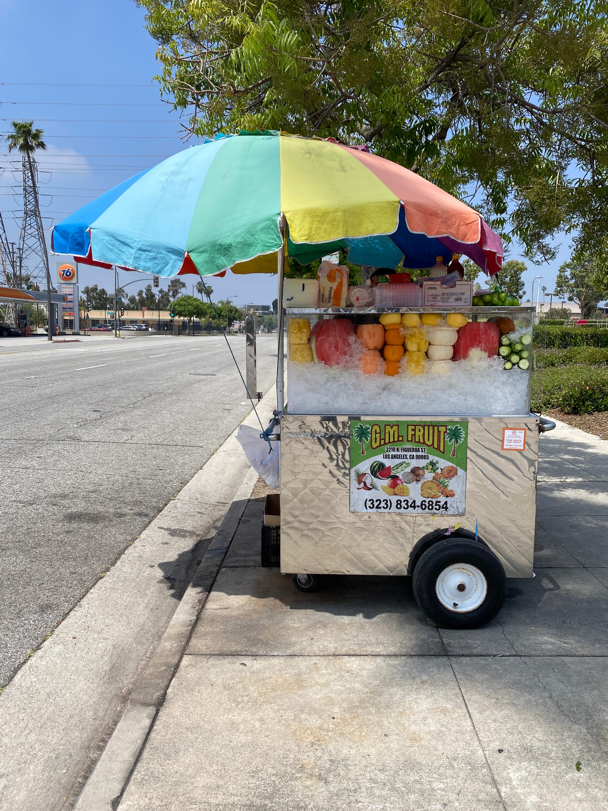
Hard-working street vendors of every stripe & background are the lifeblood of Los Angeles. You can find them in cozy neighborhoods, busy intersections, or at just about every park, concert or sporting event across the Southland. While many are good — the colorful fruit stands might just be my favorite (if you ask an Angelino what words pop into their minds when they see one, some might say “fruteros”, some say “mango carts”, some may say “rainbow carts”, others think of “pico de gallo”, etc.) On a trip to one of these glorious institutions, I fell in love with the shapes, the colors and the patterns — & I wondered what it would look like if I tried to deconstruct elements of this experience … (Side note — is it even possible to be in a bad mood while you’re eating freshly chopped fruit slathered in chamoy & Tajín? Spoiler alert: I don’t think so.) To this day, even if I don’t pull over & stop to have one of these sweet, salty refreshing treats on a sunny day — merely driving by these vibrant carts never fails to put a smile on my face.
To order a museum-quality print of this piece (shipped global, directly to you) please visit Good Mood Prints:
Why is this series called "The City Of Angles"?
I moved down to Los Angeles in 2009, and after sixteen years (!) of living in this sprawling mecca of diversity, art, entertainment, cuisine, music and culture — I finally feel like I have some perspective on one of the greatest cities on earth. After getting laid-off from my software job at the time, I decided to take on a little mini-series of paintings in honor of some of my favorite things about Los Angeles and some distinct memories I've had here — and I call it The City of Angles (see what I did there? 😉) I think that title works on multiple levels; people come to L.A. not just for the warm weather, hiking and theme parks — but lest we forget, Los Angeles is a city of dreamers ... a city of builders ... a city of artists ... a city of doers ... Heck, you might even say that everyone here ... has an angle? 📐
So my angle with this series was to return to simplicity. After all, if you asked some luminaries what they thought of simplicity?
“Simplicity is the ultimate sophistication.” — Leonardo da Vinci
or perhaps
“Simple can be harder than complex: you have to work hard to get your thinking clean to make it simple.” — Steve Jobs
So what did that mean for my paintings? Some questions I had to ask myself:
- How can I do "more with less"?
- How can I restrict the number of colors that I use in my palette?
- How can I simplify compositions to the point where shapes and lines and elements are balanced and interesting enough to "do the talking" (instead of filling the composition with needless complexity)?
- How can I leverage "negative space"?
- How can I "suggest" things in a painting (instead of just spelling it out)?
So that's where the name of the series comes from; I hope you enjoy the pieces!
🌮
Quick shout-out here to LA Taco: If I had to describe them, it would be "come for the exhaustive street taco database — stay for the indie music news & essential grassroots street-level journalism."
When I first arrived in Los Angeles, I leaned on LA Taco's map of amazing street vendors to find my favorites (& believe me, they are legion). But over time, I realized they were doing critical in-depth reporting as well. Just like the stalwart street vendors themselves, LA Taco has become a vital institution reporting on issues impacting immigration, freedom of speech — & the pursuit of life, liberty & happiness.
When I first arrived in Los Angeles, I leaned on LA Taco's map of amazing street vendors to find my favorites (& believe me, they are legion). But over time, I realized they were doing critical in-depth reporting as well. Just like the stalwart street vendors themselves, LA Taco has become a vital institution reporting on issues impacting immigration, freedom of speech — & the pursuit of life, liberty & happiness.
🎨 Process
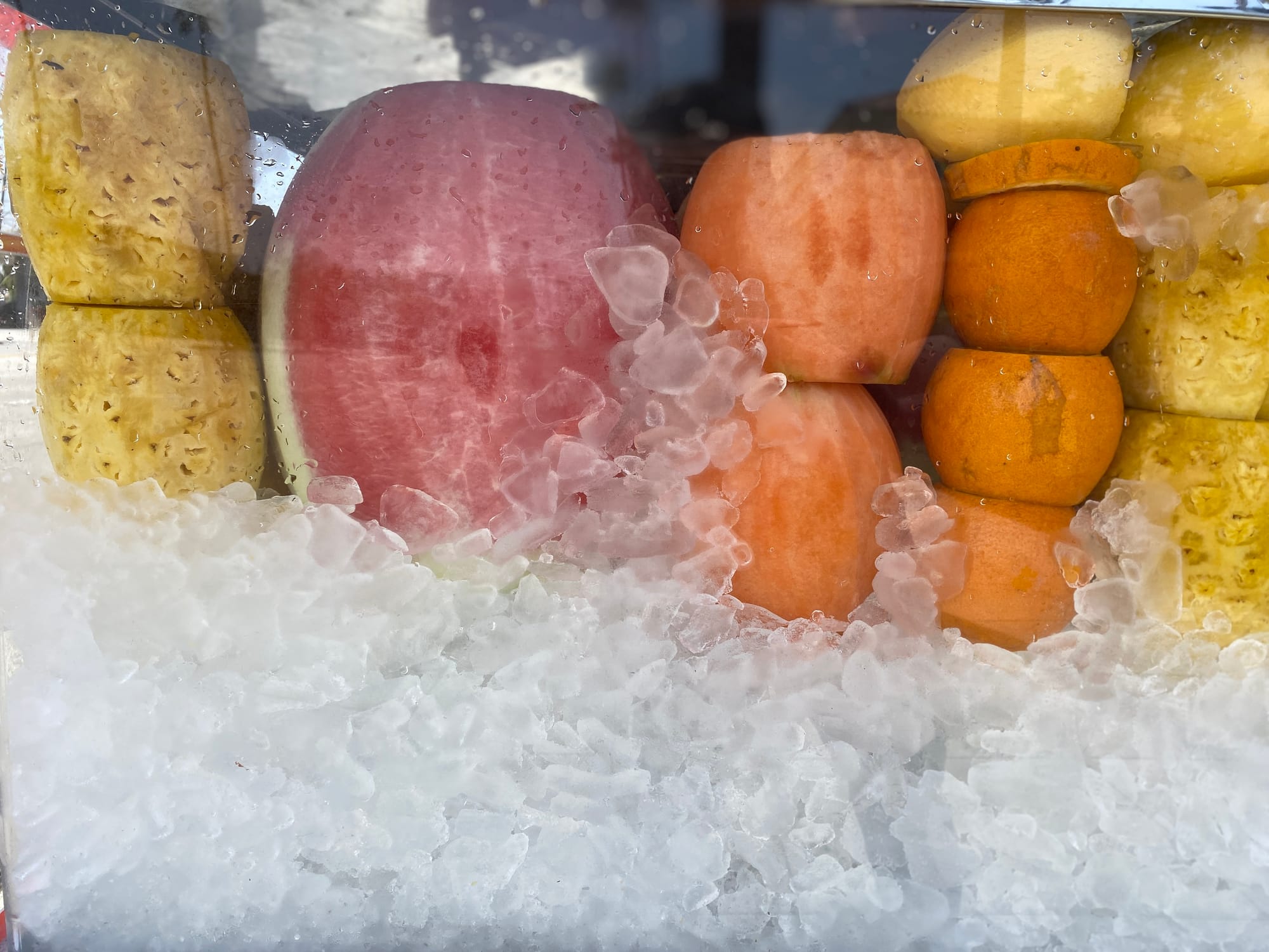
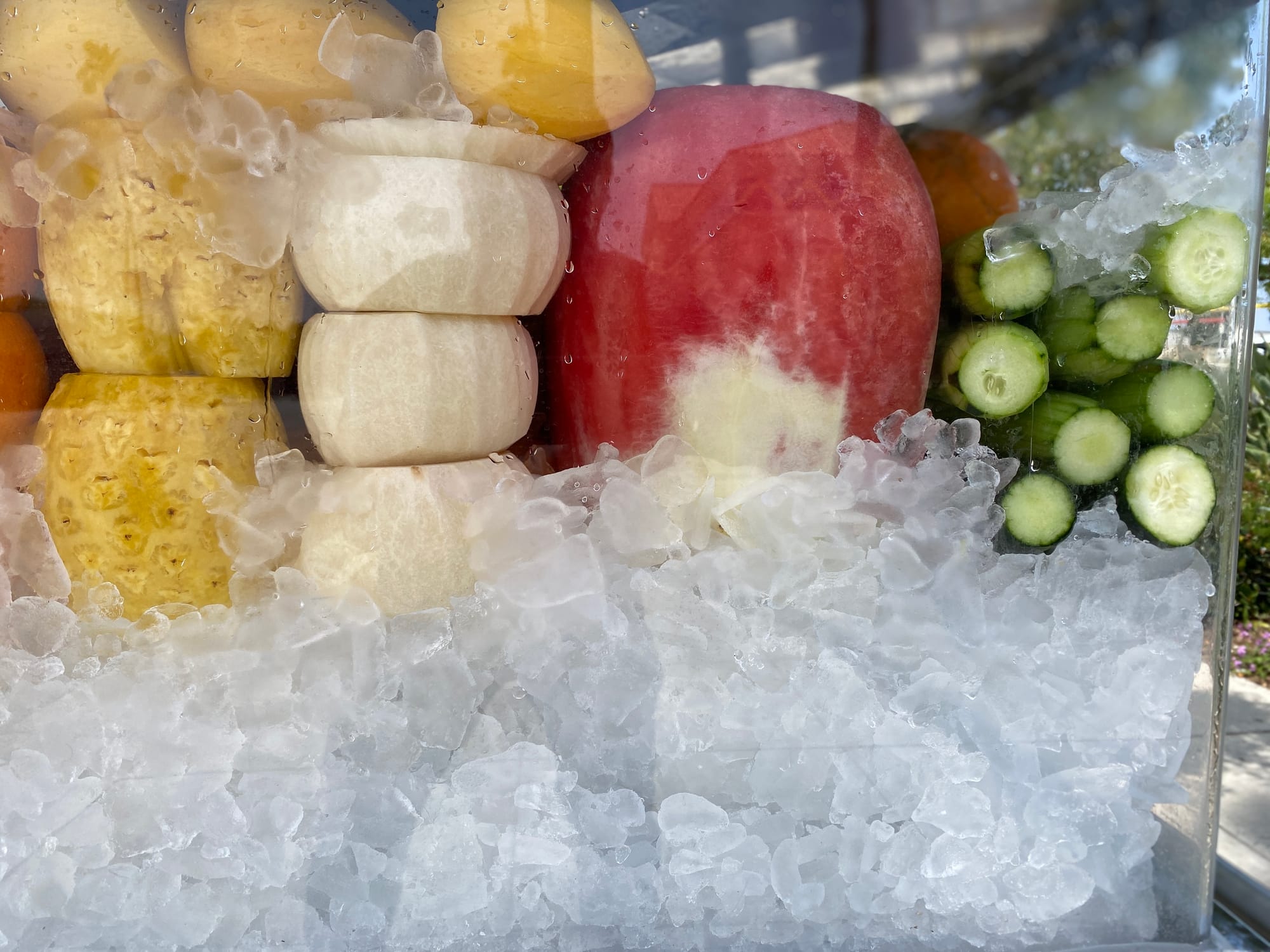
I’ve long been a fan of these delicious treats, but one day it just sort of “hit me” … I was visiting a frutero (near Pasadena, CA) and the whole scene was just … perfection. I snapped pictures to remember as much as I could about the scene when I got home:
The colors …
The shapes …
The flavors!
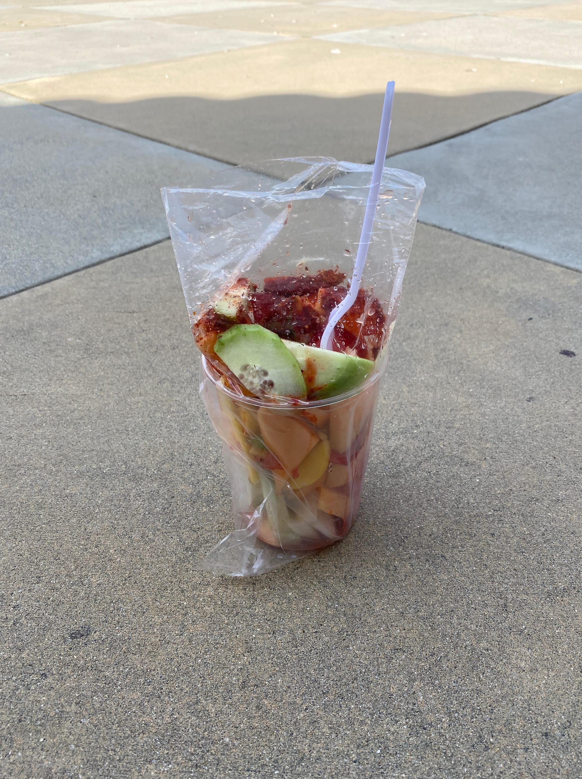
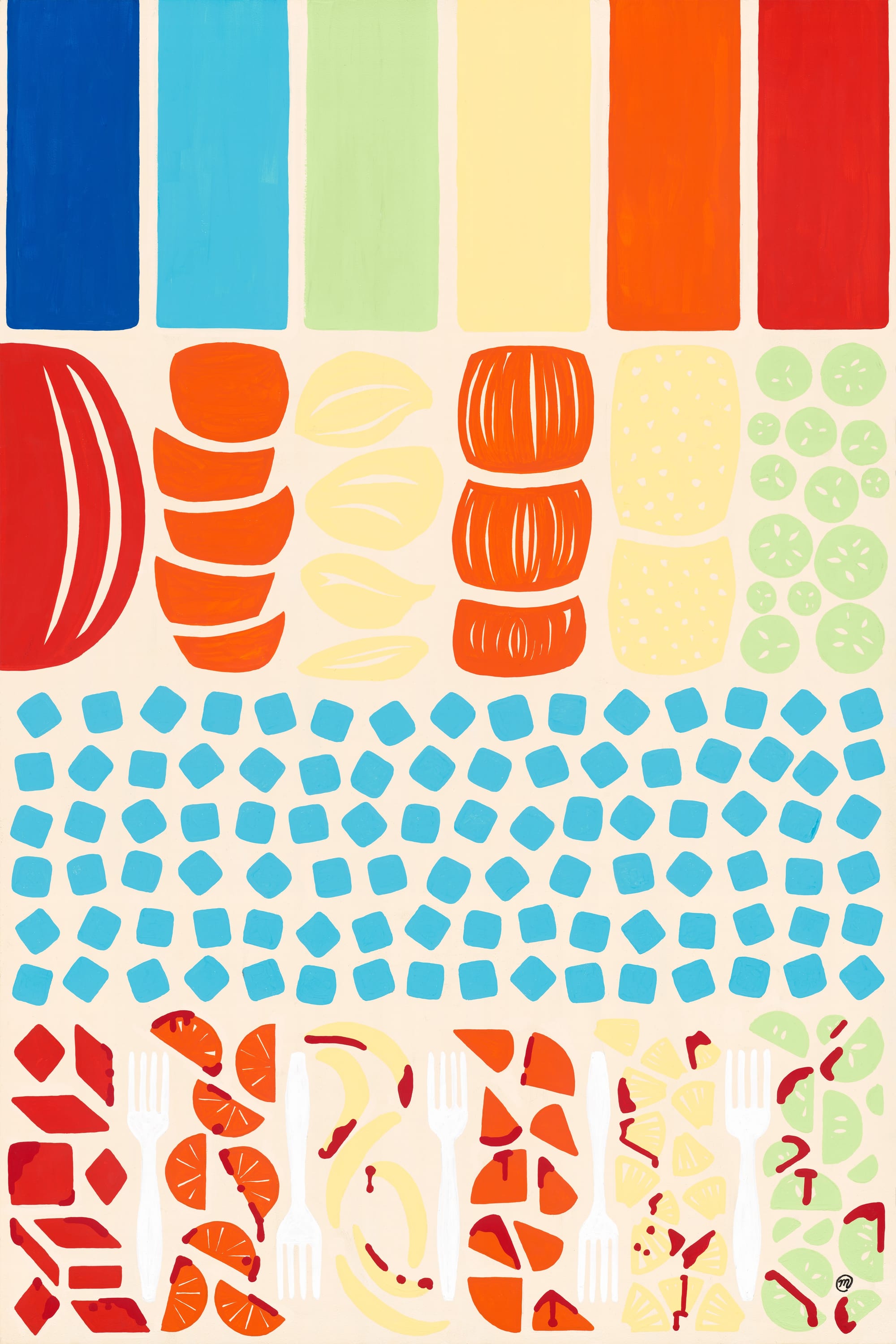
… so when I got home, I started thinking about how I could break this whole experience down into elements: the ubiquitous umbrella, the stacked layers of fruit, the cool bed of ice — and of course, the chopped & dressed treat in its final form (moments before it disappeared into my gut)!
For me, the composition usually always begins as a sketch on paper … this piece was no different. I went through a few iterations of this, and while I didn’t preserve those earlier concepts, I did land here, and this felt “right”.
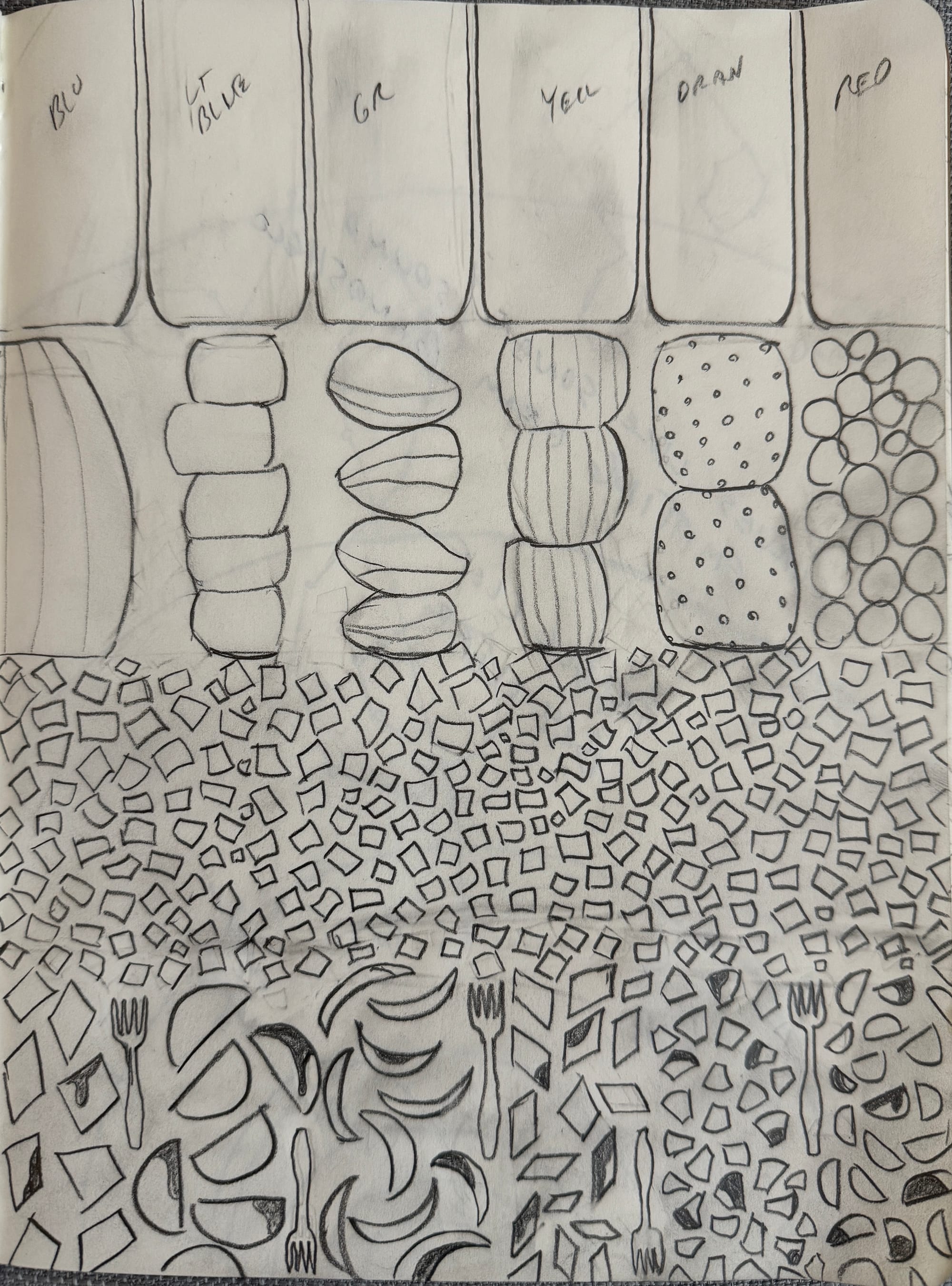
I liked the idea of seeing four “layers” in this piece, exploring both “symmetry” and ”asymmetry”. I savored the challenge of creating “negative space” (between the fruit, between the segments of the umbrella, etc). After feeling pleased with the pencil sketch, I imported it into the design app Procreate, and proceeded to do some rough color tests.
0:00
/0:29
Timelapse video of rough color treatments for Rainbow Cart (using Procreate app)
This exercise helped me think about what colors I wanted to use, and how / where those colors would repeat throughout the piece … On that note, I did chose to not include every fruit or vegetable (I left out “jicama” for example) partly because I wanted to restrict each vertical lane to one stack of fruit … also I wanted to simplify the color scheme.
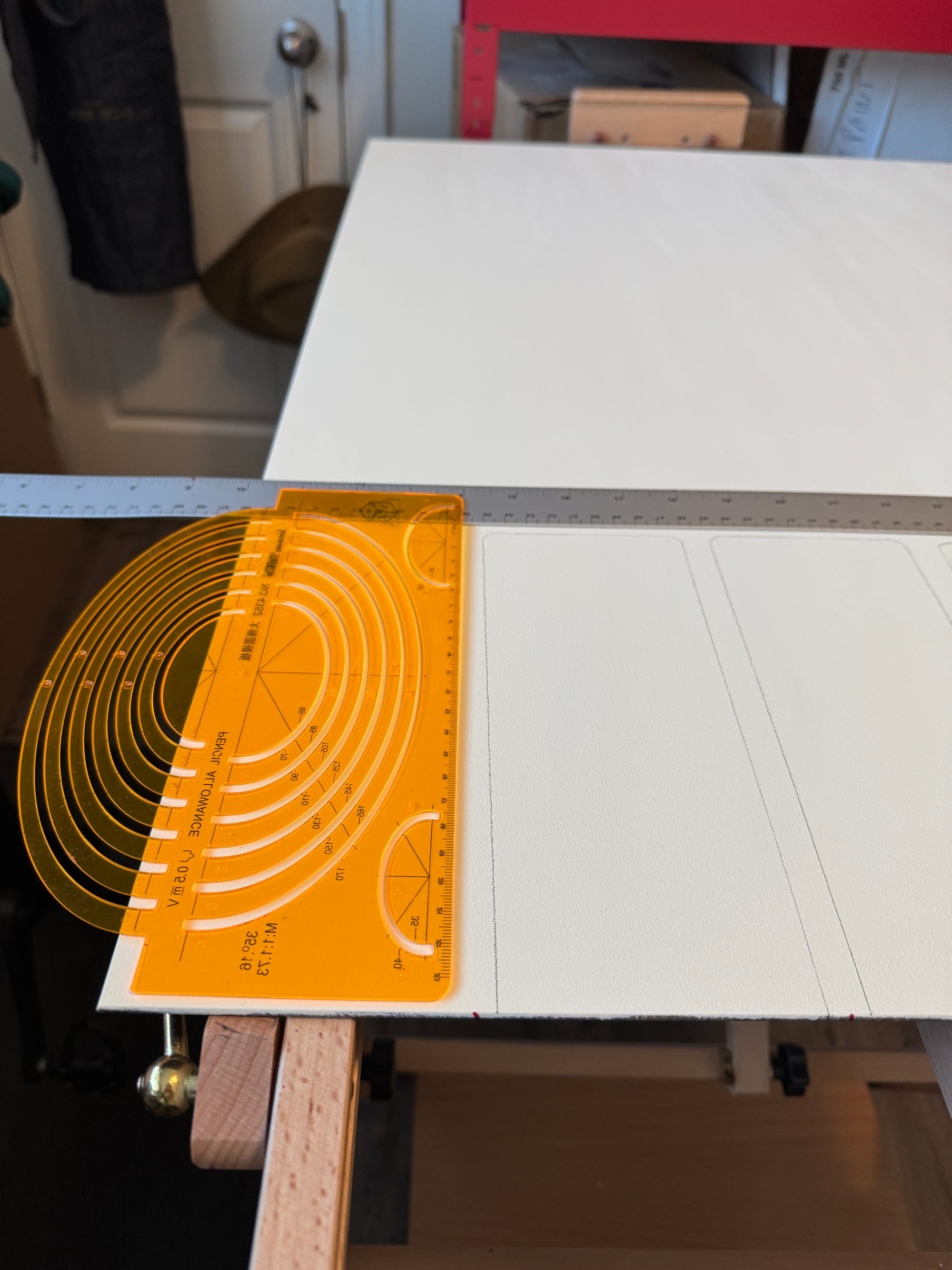
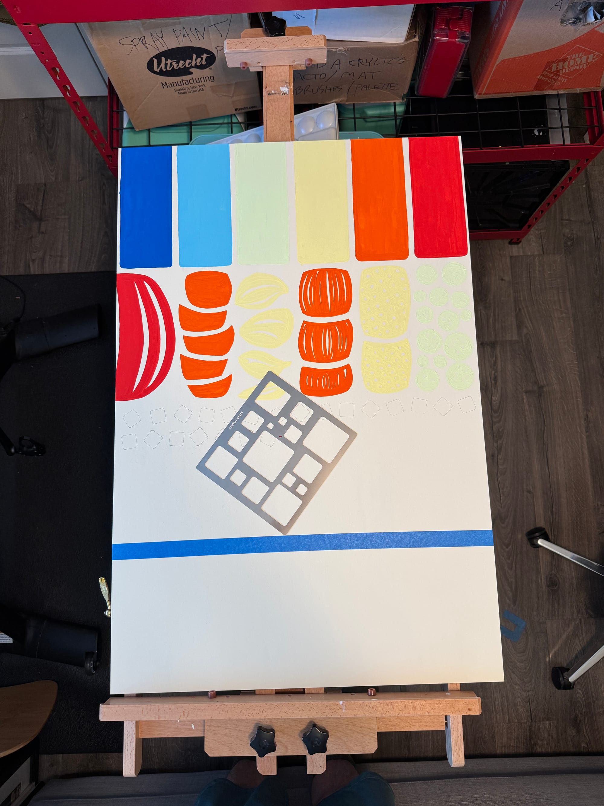
Feeling ready to move back to the “analog” world, gave the background a coat of a bit warmer tone of white … (more like a cream) …
I then grabbed a stencil to rough in the simplified rounded-rectangle shapes suggesting the different pieces of the rainbow-colored umbrella …
Sometimes I rough in the sketch for the whole piece first, but this time, I chose to just “develop it on the board as I went” … What do I mean by that?
Well, I knew the umbrella shapes would essentially dictate the “vertical lanes” for the rest of the piece, so I worked to rough those in first, since they were vital to “set the tone”.
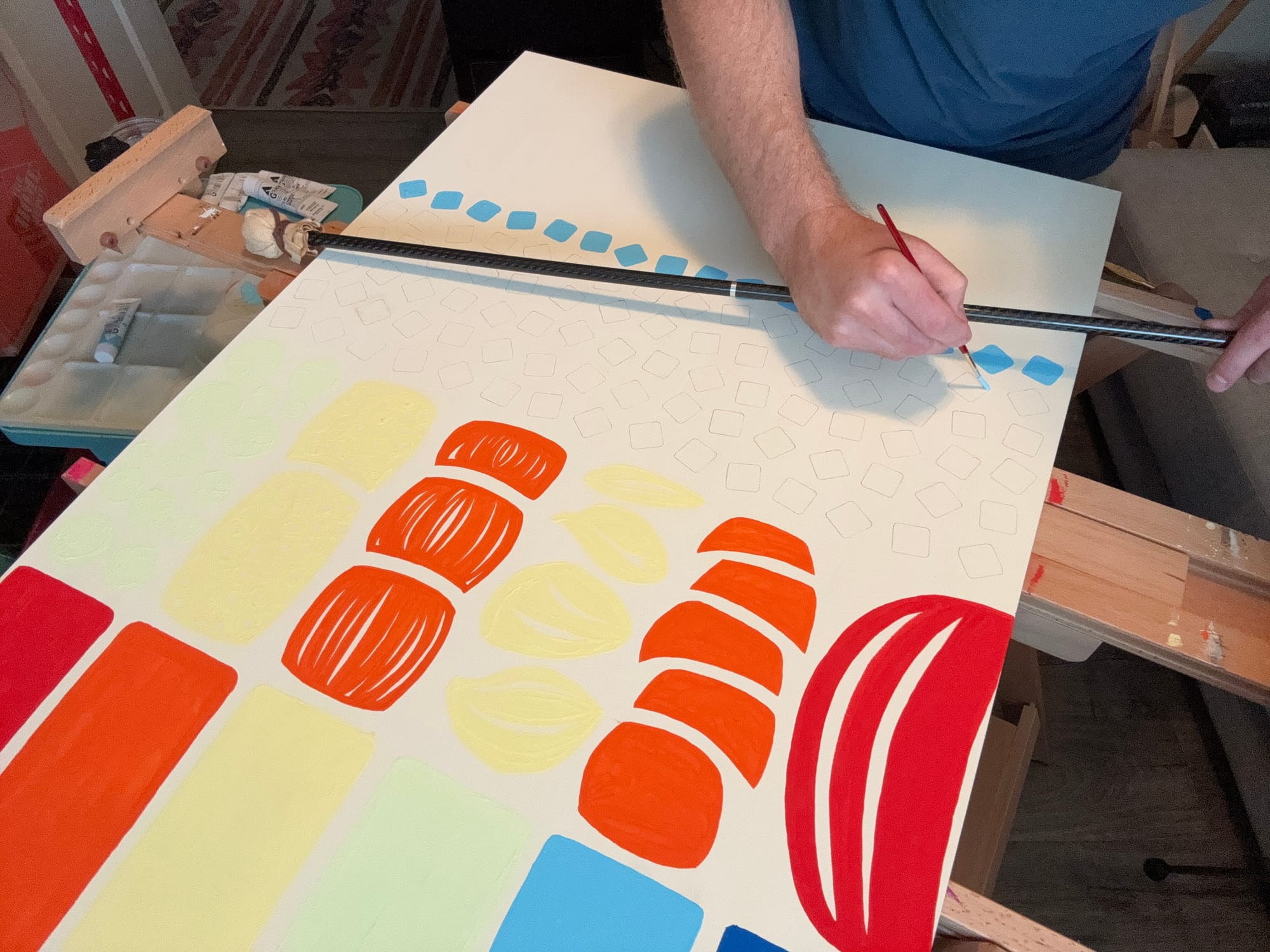
Then, I worked on the second layer of “prepped fruit”; one thing to note here, I actually didn’t ”sketch” anything with pencil on this layer, instead I just chose to “sketch with the paint”. In many ways, this can be “riskier”, but in the moment, it allowed me to move forward while I was inspired, without scuffing up more pencil on the board — and really just “go with the flow”. I was essentially “painting with negative space” … i.e. thinking of ways the negative space could suggest slices or pith or seeds …
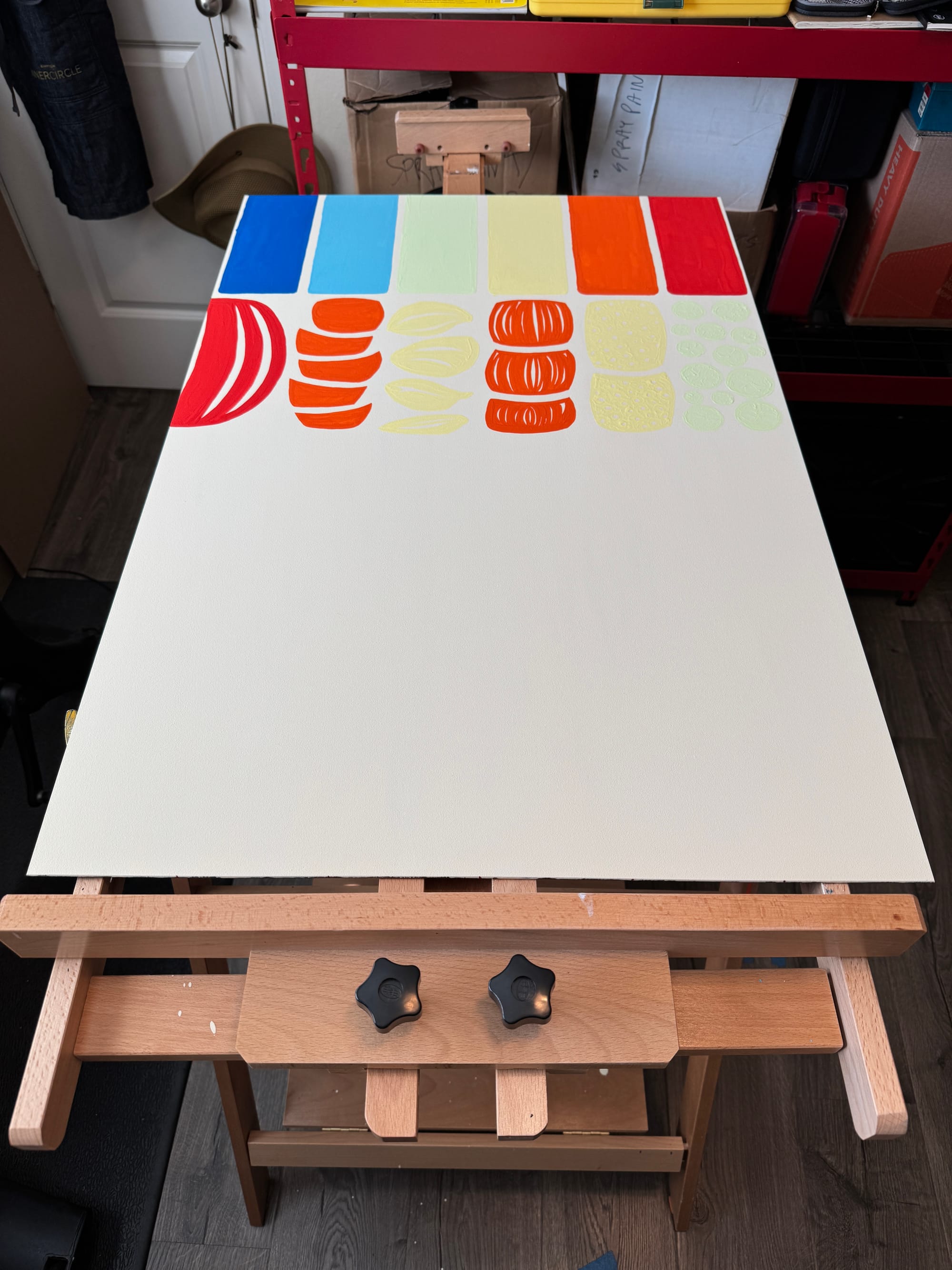
With the second layer complete, I then moved down into the ”layer of ice”; instead of adding pencil lines to make barriers (so that sections were proportional) I chose to use masking tape, so again, less pencil scuff on the board …
But there was a lot of pencil in this third section; I wanted these ice cubes to be relatively close in shape and size, to really drive home clean shapes and repetition here. I used a stencil to come up with this ”rounded square” for the ice, and this section took quite awhile to create …
There were many ice cubes to draw (to fill this space up, but again — never let them touch … let them hover and create negative space …)
Now that this was roughed in with pencil, I went on to paint each square, row-by-row, with the assistance of a handy tool called a “mahl stick”.
What is the “mahl stick” used for?
The mahl stick is an old-school tool that painters have used for hundreds (if not thousands) of years … It’s pretty simple: it provides a sturdy rail for painters to rest their wrists above the surface of the painting … One side is anchored (usually with a soft ball that is wrapped in cloth) and one side is elevated (which you can hold or rest on something stationary like your easel). It’s useful for several reasons:
- When you don’t want to drag your palm through pencil or charcoal sketches
- When you don’t want your hand to drag through wet paint
- When you just need to give your muscles some relief (after holding your arm & wrist in a specific posture for hours on end)
I don’t always use it, but for certain scenarios — it can be a life-saver!
Painting each individual ice cube was tedious (and getting the edges to feel “clean” was a lot of effort) … & yet there was something kind of zen and repetitive about this section. It was a lot of work, but ultimately was rather satisfying.
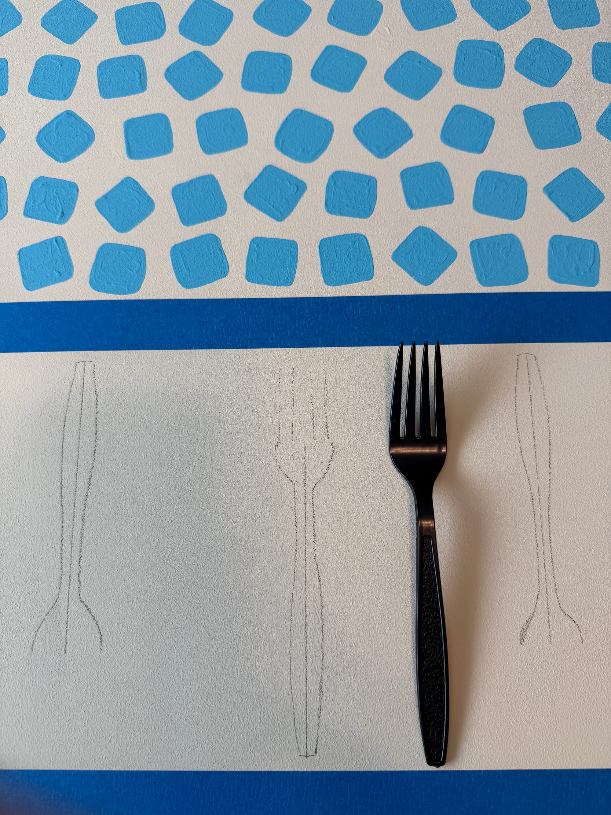
Onto the fourth (& final) layer! For this layer, I wanted to evoke the “chopped / dressed” fruit, but again, deconstructed … I knew that I wanted to include the iconic “white plastic fork” in this section (of which I used a black plastic fork as reference, but you get the idea) which ultimately turned out to be a helpful element to add a feeling of “borders” to each piece of fruit …
For this section, I took great inspiration from the distinct shapes each fruit had in the fruit cup, and also the occasional bright-red dollop of chamoy & Tajín … With this in my mind, I set about to (again) use negative space to suggest seeds and directional fibers natural in the fruit … I intentionally showed the same fruit (that was in a more whole form) above as below, and yet this time its in a different state … It was fun for me to think of that relationship: i.e. what the oranges look like before they were chopped, and then (separate by a sheet of ice) what they look like after being prepared …
I had a lot of fun thinking about how the drips of the vibrant red sauce would cling & stretch & slide vertically down the piece implying a bit of gravity …
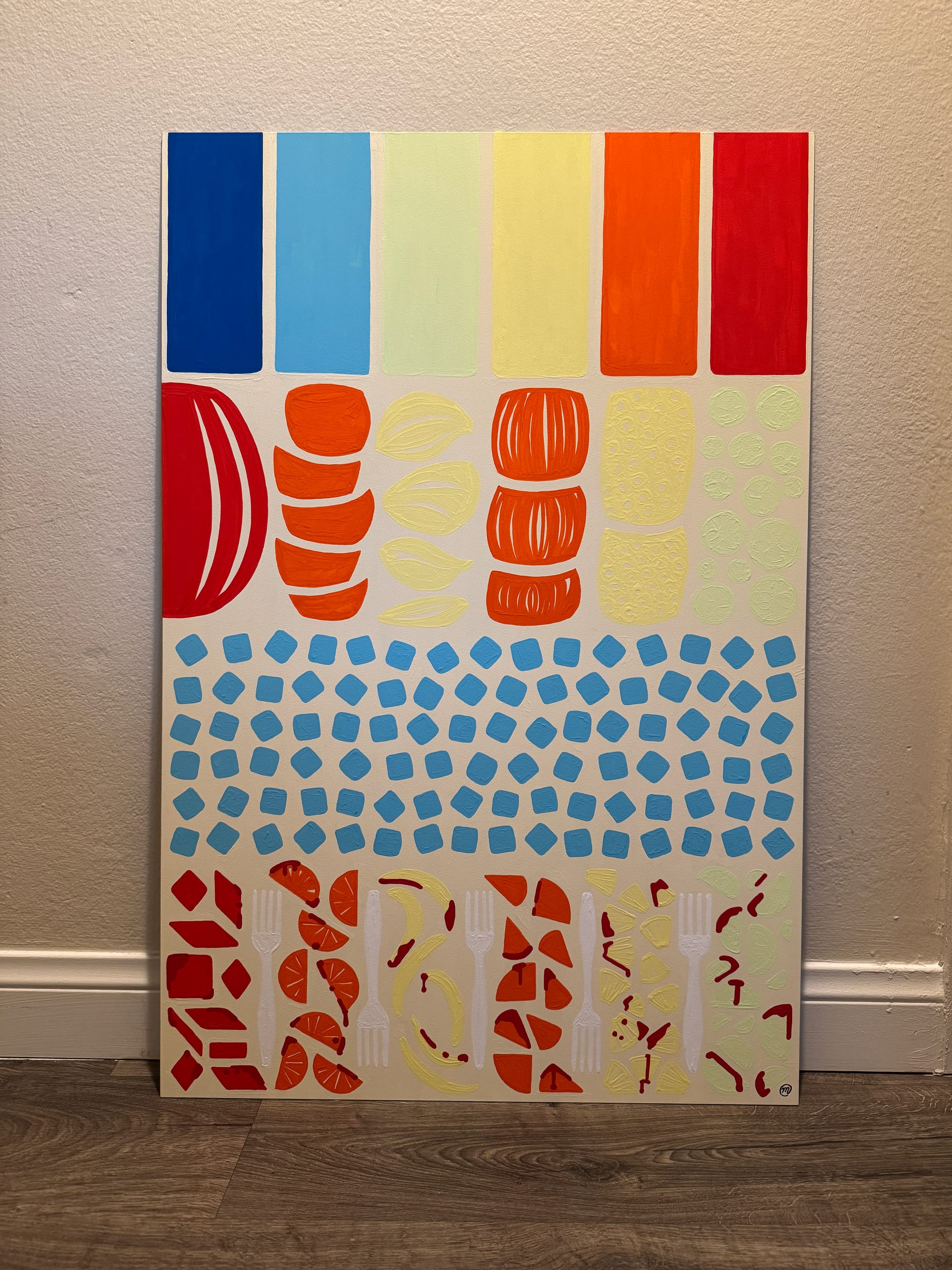
After putting the finishing touches on it & signing the piece — I took it over to the fine folks at POV.STUDIO to do a high-resolution scan of the final work.