
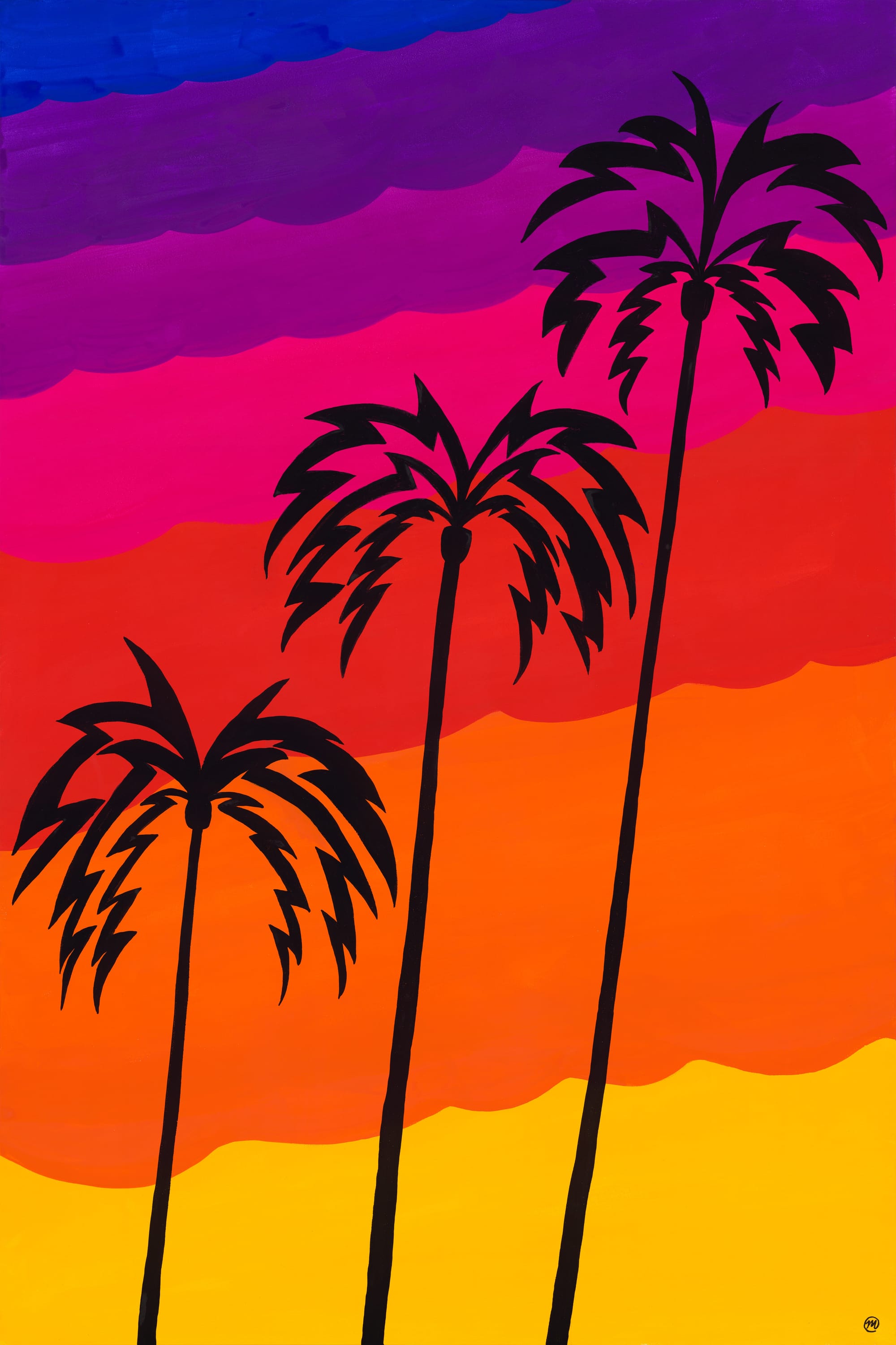
Sunsets in L.A. just hit different. While they may not happen everyday — Angelenos are often treated to a kaleidoscope of sherbet-like colors in the sky as they drive home from work or play. Chances are pretty decent they also may be cruising down a street that happens to be lined with the silhouettes of tall, elegant palm trees. When both of these are viewed together? It’s a bit of magic.
To order a museum-quality print of this piece (shipped global, directly to you) please visit Good Mood Prints:
Why is this series called "The City Of Angles"?
I moved down to Los Angeles in 2009, and after sixteen years (!) of living in this sprawling mecca of diversity, art, entertainment, cuisine, music and culture — I finally feel like I have some perspective on one of the greatest cities on earth. After getting laid-off from my software job at the time, I decided to take on a little mini-series of paintings in honor of some of my favorite things about Los Angeles and some distinct memories I've had here — and I call it The City of Angles (see what I did there? 😉) I think that title works on multiple levels; people come to L.A. not just for the warm weather, hiking and theme parks — but lest we forget, Los Angeles is a city of dreamers ... a city of builders ... a city of artists ... a city of doers ... Heck, you might even say that everyone here ... has an angle? 📐
So my angle with this series was to return to simplicity. After all, if you asked some luminaries what they thought of simplicity?
“Simplicity is the ultimate sophistication.” — Leonardo da Vinci
or perhaps
“Simple can be harder than complex: you have to work hard to get your thinking clean to make it simple.” — Steve Jobs
So what did that mean for my paintings? Some questions I had to ask myself:
- How can I do "more with less"?
- How can I restrict the number of colors that I use in my palette?
- How can I simplify compositions to the point where shapes and lines and elements are balanced and interesting enough to "do the talking" (instead of filling the composition with needless complexity)?
- How can I leverage "negative space"?
- How can I "suggest" things in a painting (instead of just spelling it out)?
So that's where the name of the series comes from; I hope you enjoy the pieces!
🎨 Process
The initial germ of the idea came from three palm trees that rose sharply over my apartment in the San Gabriel Valley ... I'd gaze up at these spindly and majestic Dr. Suess-like trees everyday for years ...
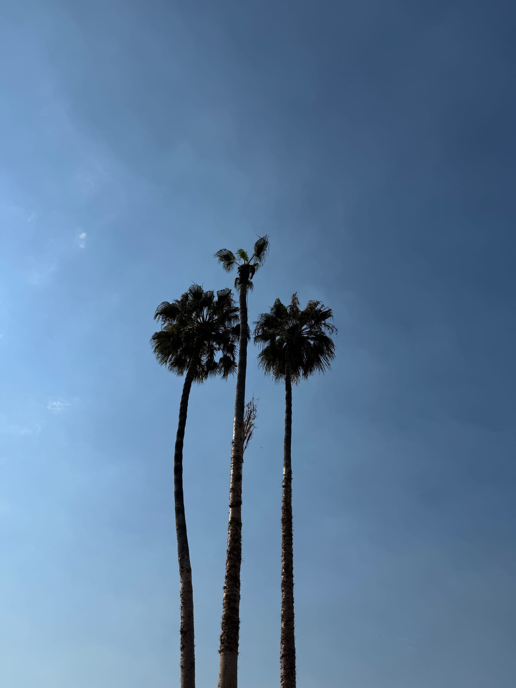
So I thought, you know — I might be onto something here ... but while this little trio was indeed appealing — it wasn't quite as "dynamic" as I was hoping for ... Later on, I remembered cruising down avenues (all over Los Angeles) and seeing palm tree after palm tree slightly bend at a diagonal as I rolled into the sunny evening. I wanted to catch that motion ... that feeling of seeing trees get bigger as I sped by them ... I also happen to love diagonal motion in compositions, so here's where I landed with that idea:
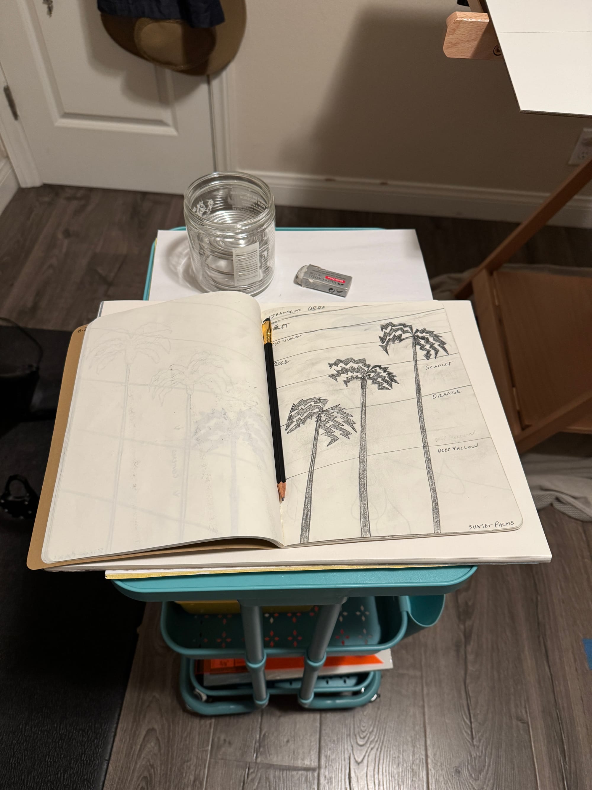
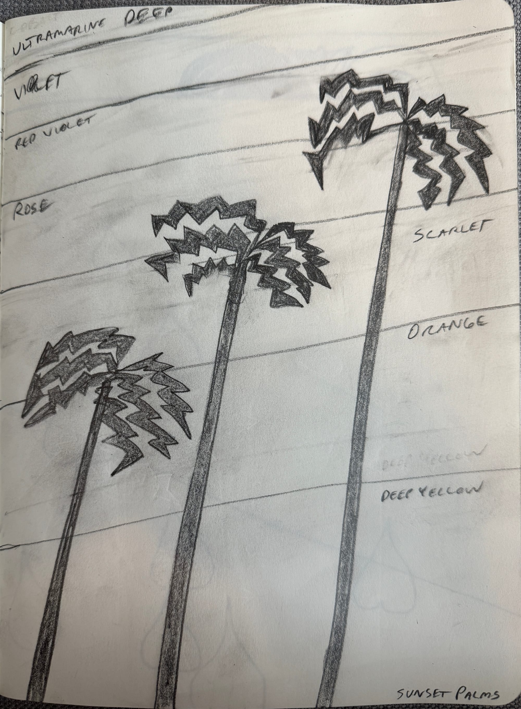
After sketching a rough composition I was pleased with, I then snapped a photo of the sketch:
… and imported it into Procreate, an incredible design app for iOS. On my iPad, I then experimented with some different color tones, and I tried to approximate real paint colors as best I could …
0:00
/0:08
Timelapse video of rough color treatments for Sunset Palms (using Procreate app)
I felt pretty good about this color progression, so I turned back to the “analog” world and used a straight edge to rough-in the background layers with pencil.
My studio for this series was tiny ... literally just enough room to put my paint on a cart and allow my easel to lay flat.
Why did the easel need to be flat?
The type of paint I used in this series is called gouache, which is essentially a matte, opaque watercolor (more on that below) — and watercolors, well, frankly my dear — they don't care about your feelings, they'll go wherever they want to go (so a flat surface is best)!
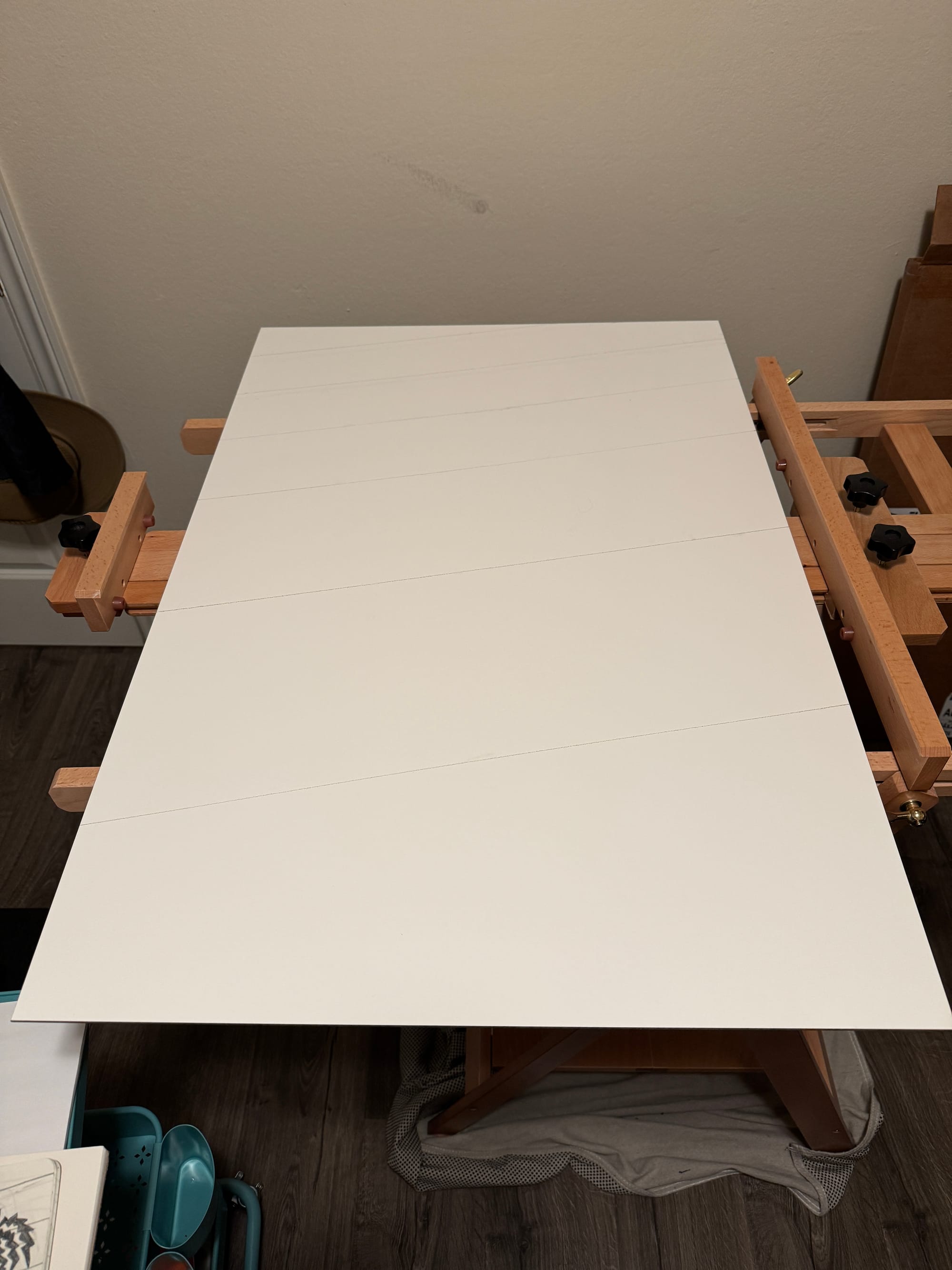
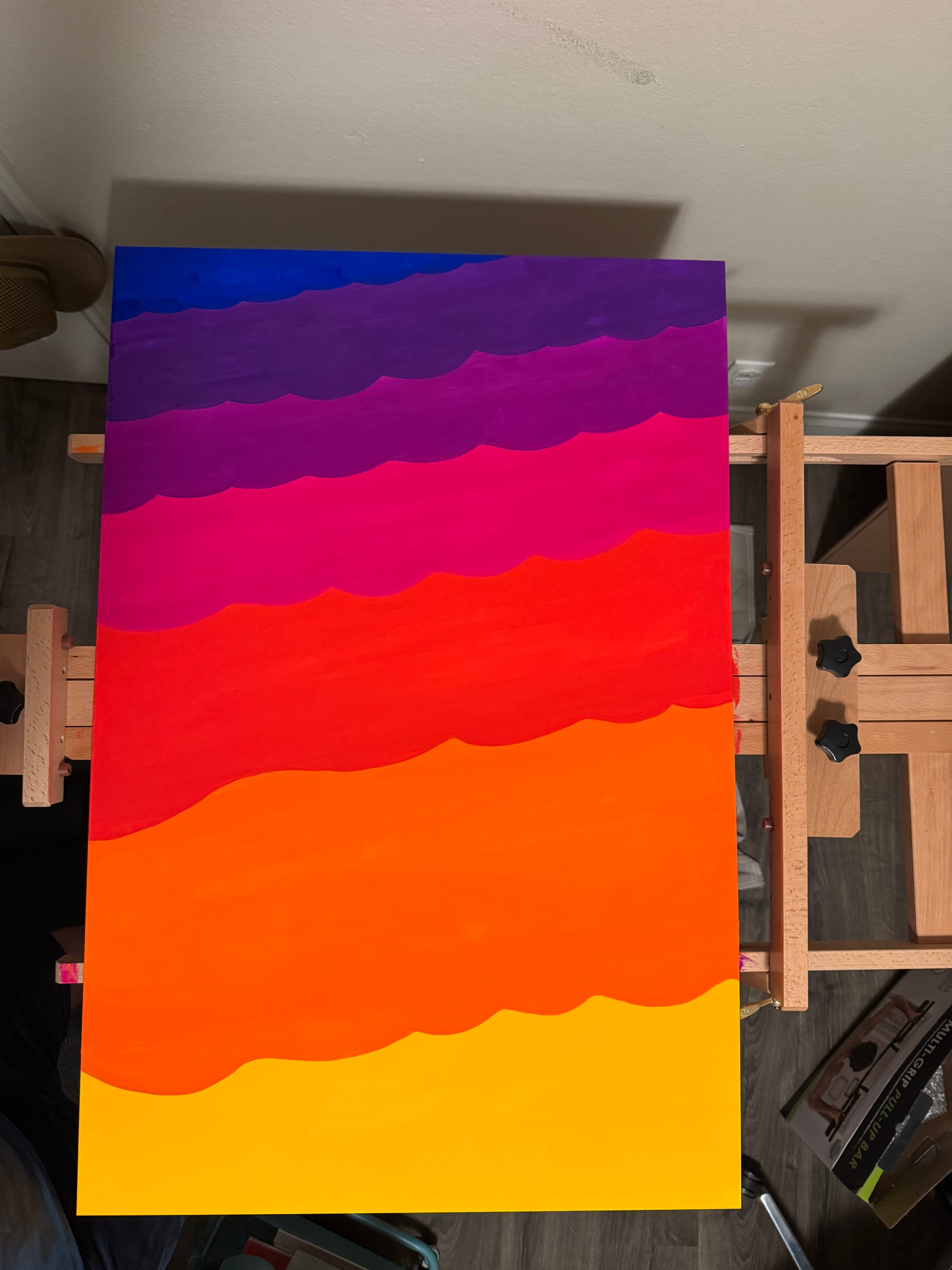
You may notice in the original sketch (and also the first lines sketched on the board), the lines are crisp and straight, however when I painted the background — the colors became “flowing” & "rounded" ... At some point I made the decision to undulate the edges of each bar of color ... I think ultimately I felt that:
- a) the curves behind the sharp edges of the palm silhouettes gave a little contrast & variety of shapes to the piece
- b) organic curves can be more "forgiving" than clean straight edges, &
- c) perhaps most important — the smooth rolling bounce "suggested" striated clouds ...
I liked it, so I went with it.
One of the goals of this series was to really lean into "negative space" ... I had a fun time sketching these palm trees so they almost touched ... but they never actually do. They get just close enough to generate some "energy" between the shapes ... (Such a tease those palm trees!)
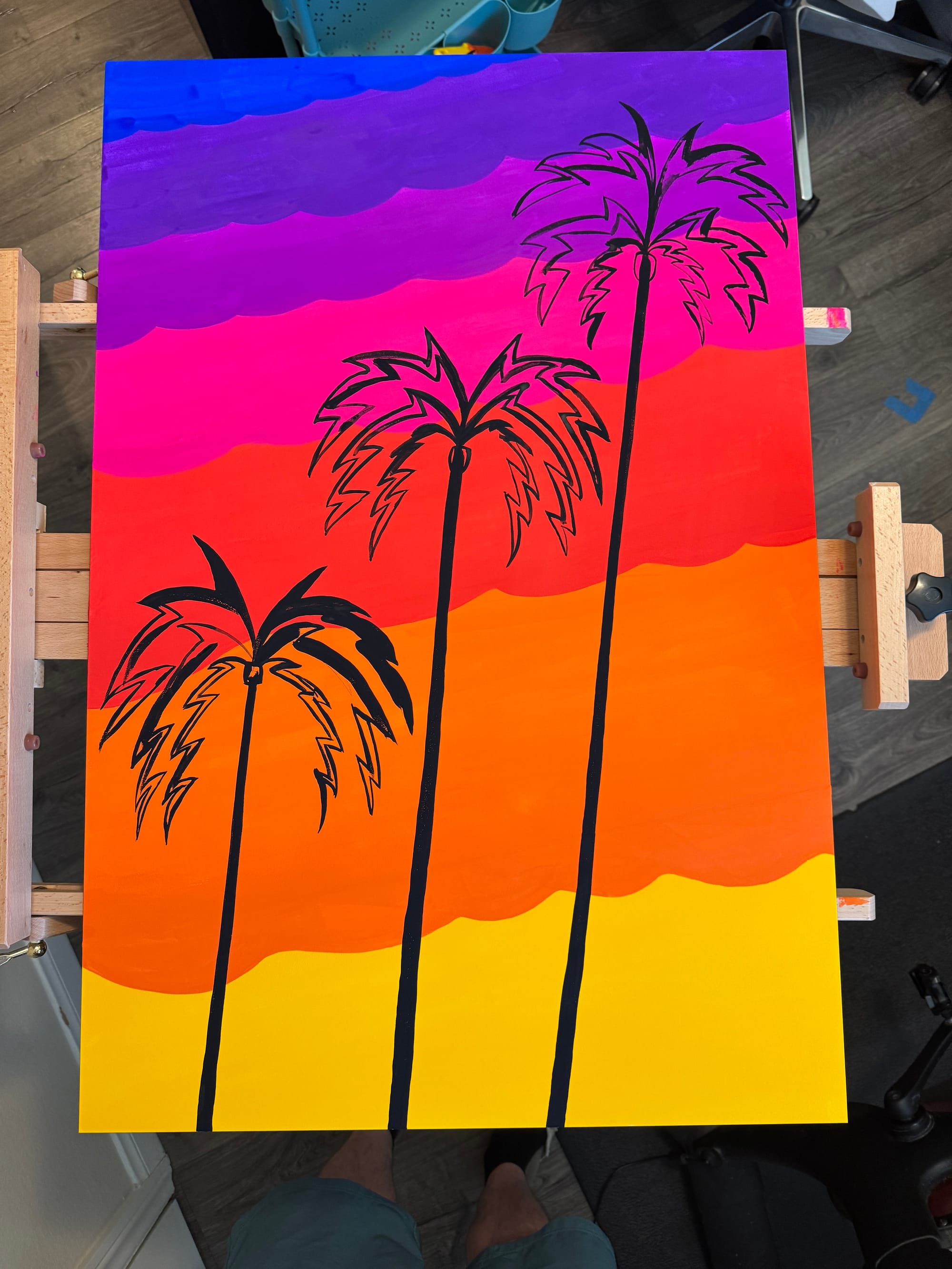
I will say it was more challenging than I initially anticipated getting solid coverage of the black gouache over the vibrant colors underneath ... Gouache is certainly opaque, but it is watercolor (after all) so trying to build up layers with it can be tricky ... This is one of the reasons I chose acrylic gouache (meaning the layers can dry more-or-less permanent), and here it came in very handy; it allowed me to steadily build up layers until the silhouettes were complete. Speaking of acrylic gouache, I chose the highest caliber paint I could find: Holbein Artist Watercolor ... and in this piece, I barely diluted the paint, partly because I really wanted the colors to be a punch in the face, just like the mind-blowing sunsets of Los Angeles ...
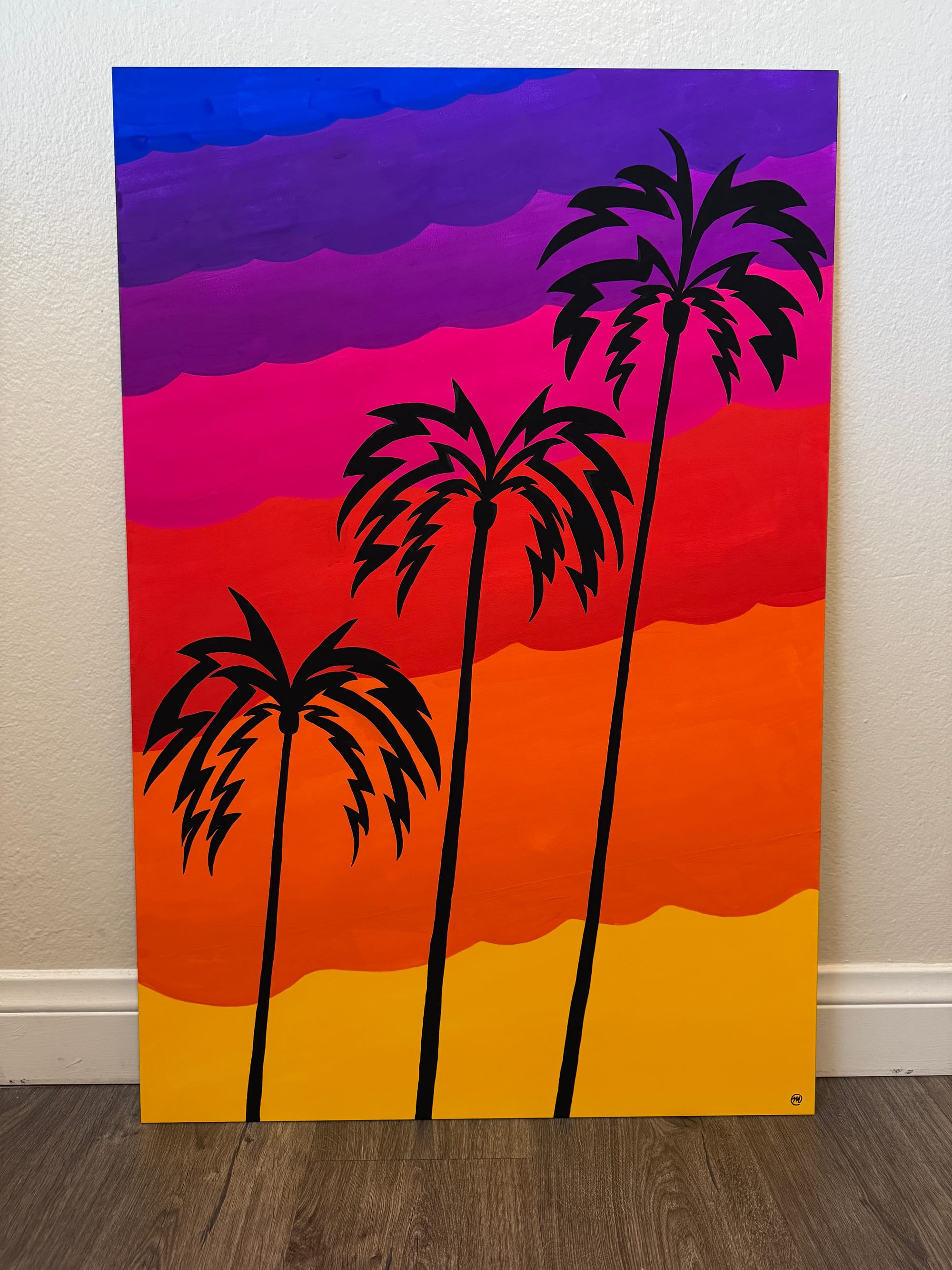
After putting the finishing touches on it & signing the piece — I took it over to the fine folks at POV.STUDIO to do a high-resolution scan of the final work.