
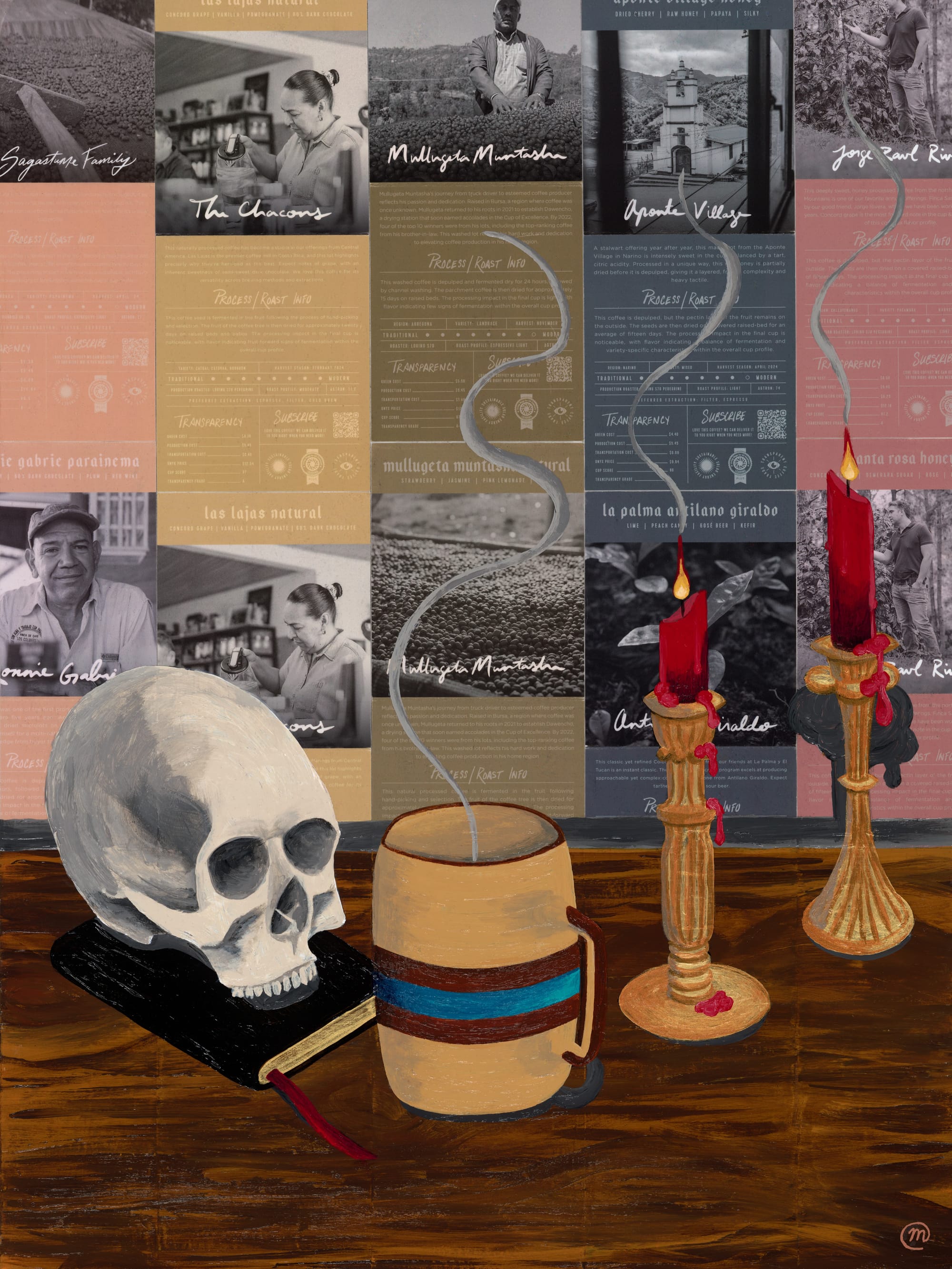
My morning ritual consists of brewing freshly-ground coffee & sipping it while I ruminate & journal (often by candlelight) using passages based on stoic philosophy, spirituality & mindfulness as inspiration. On a separate note, for many years, I’ve wanted to create my own “memento mori” visual piece, but not merely to emulate the work of artists who came before me — I wanted to do it my (weird?) way, in a way that had relevance and meaning to me (however I just wasn’t sure what that would look like) ... Long story short, after collecting “liner notes” from beautiful boxes of coffee for quite some time, one day it donned on me: just like coffee is (literally) the backdrop of my meditative mornings, these liner notes could serve as a backdrop to a painting … almost like “wallpaper” to my own memento mori ... Thus, “Memento Mornings” was born.
🎨 Process
As sure as the sun rises every morning, I brew coffee (unless I'm traveling, but even then sometimes I lug around coffee-making equipment with me). Coffee is one of my passions: finding the best quality beans & roasts, grinding the beans fresh, smelling the intoxicating aromas as I brew the coffee ... For me, this ritual is a visceral, soothing, zen experience ... It puts me in the right "mind space" to start my day ... Once I have my coffee brewed and ready to go, I read passages based on stoic philosophy, spirituality and mindfulness, and then I start journaling and thinking about the deeper things of this world ... (or not, sometimes I just ramble).
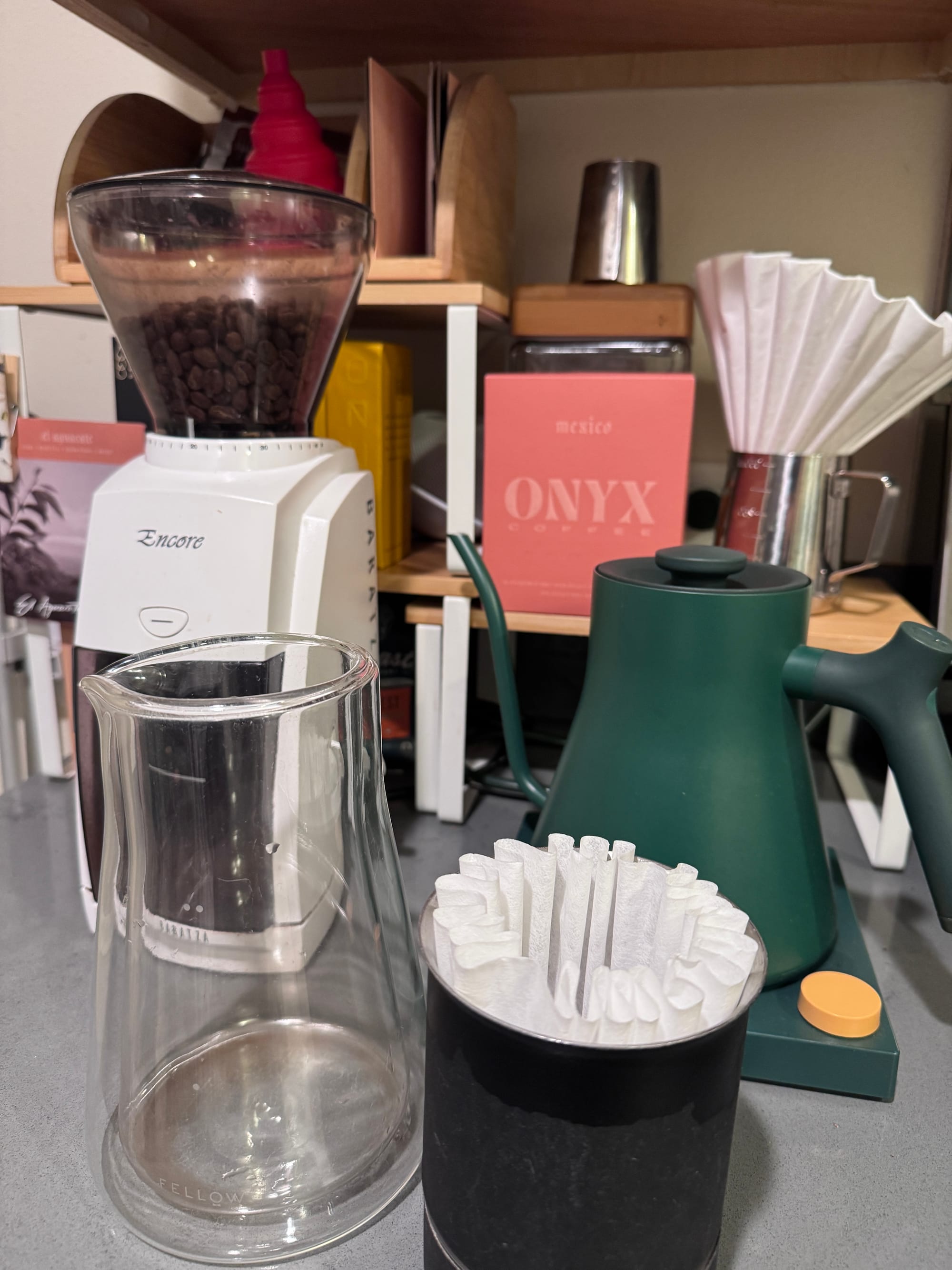
What's in your current coffee setup?
I'm glad you asked! Right now it looks like this:
- YESPLZ Coffee Subscription
- Fellow Stagg EKG Electric Kettle
- Fellow Stagg [XF] Pour-Over Set
- Encore Baratza Coffee Grinder
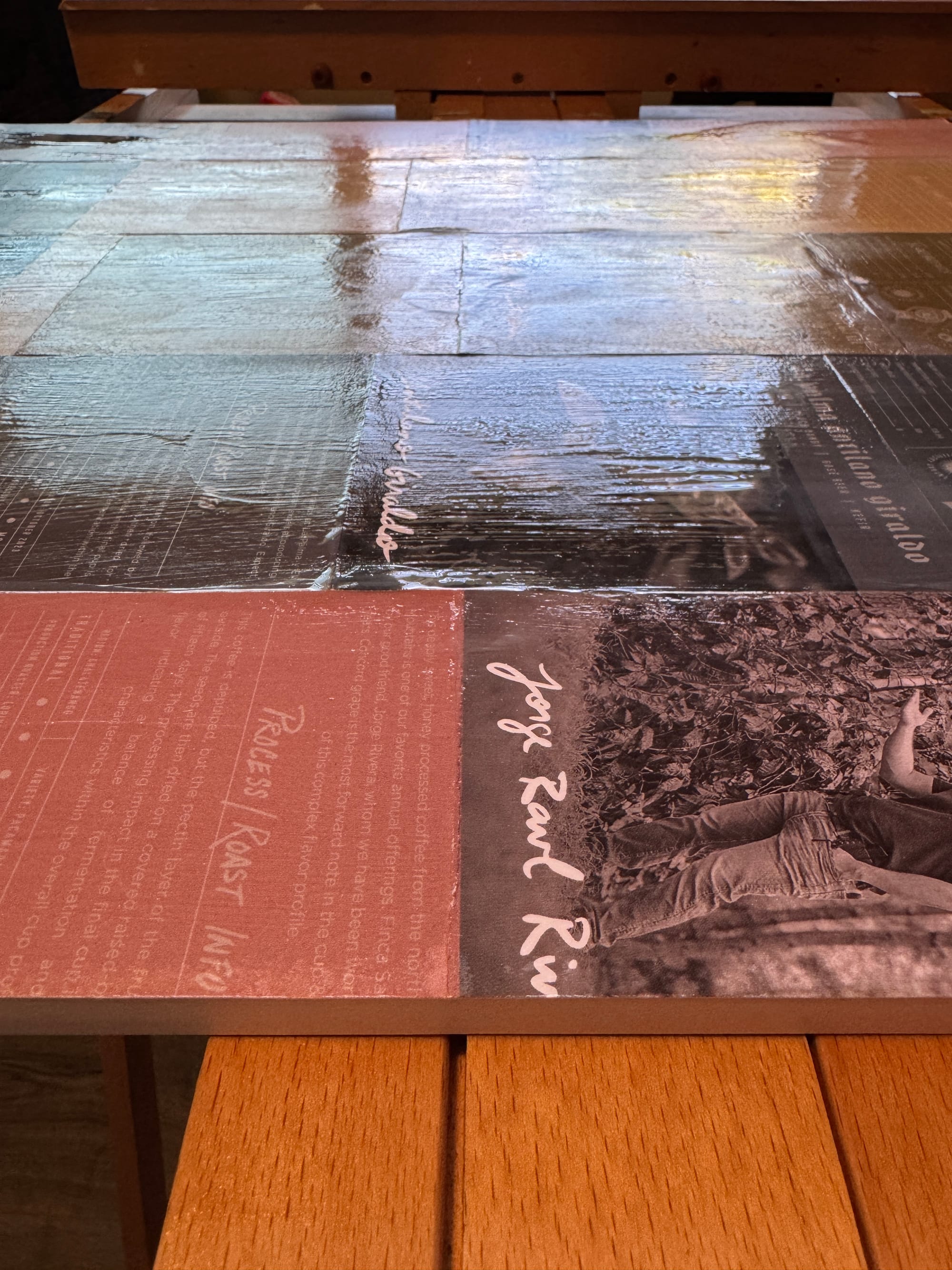
I knew from the dribble* (*this pun works on two levels) coffee liner notes would make a gorgeous backdrop ... I loved their muted palettes, typography, photography, stories of farmers and craft, etc. So I first started laying these out in different configurations, and ultimately I landed on slightly alternating their heights, feeling a bit like brickwork ...
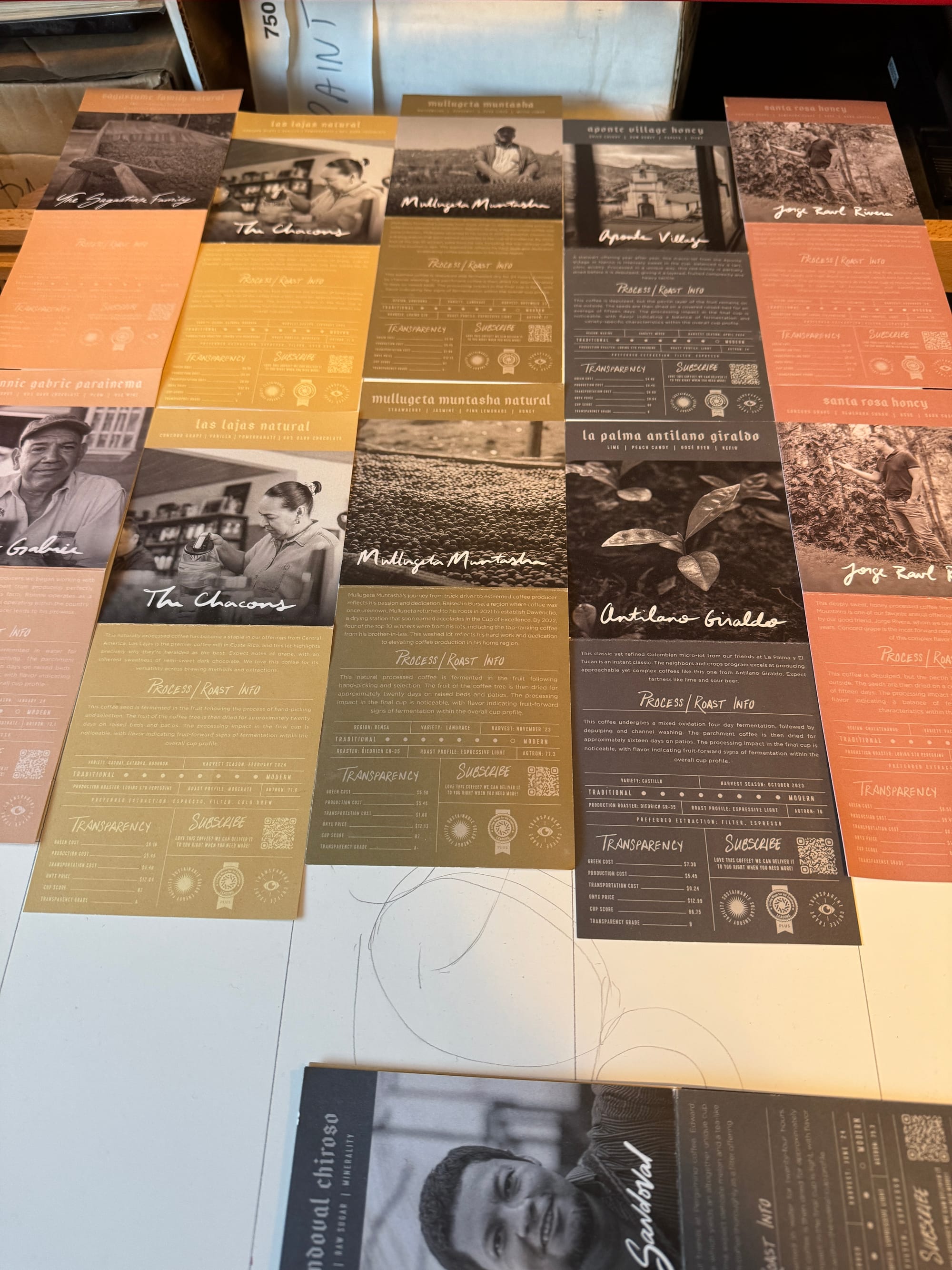
Once I had the pattern for the background "roughed-in", I went ahead and used acrylic gel medium to affix each piece into place. This was a little tricky because while they were made with thicker paper, they were still just paper, so they definitely wanted to buckle here and there. After setting them in place, I did several layers of the medium, one at a time, and let them dry before adding additional layers. This was partly for protecting the papers, but also to provide a little depth. I also kind of had to "work fast", because the more you handle these papers, the easier it is for the ink / colors to rub off and fall apart ... definitely diminishing returns here, so I had to be fairly deliberate with my movements.
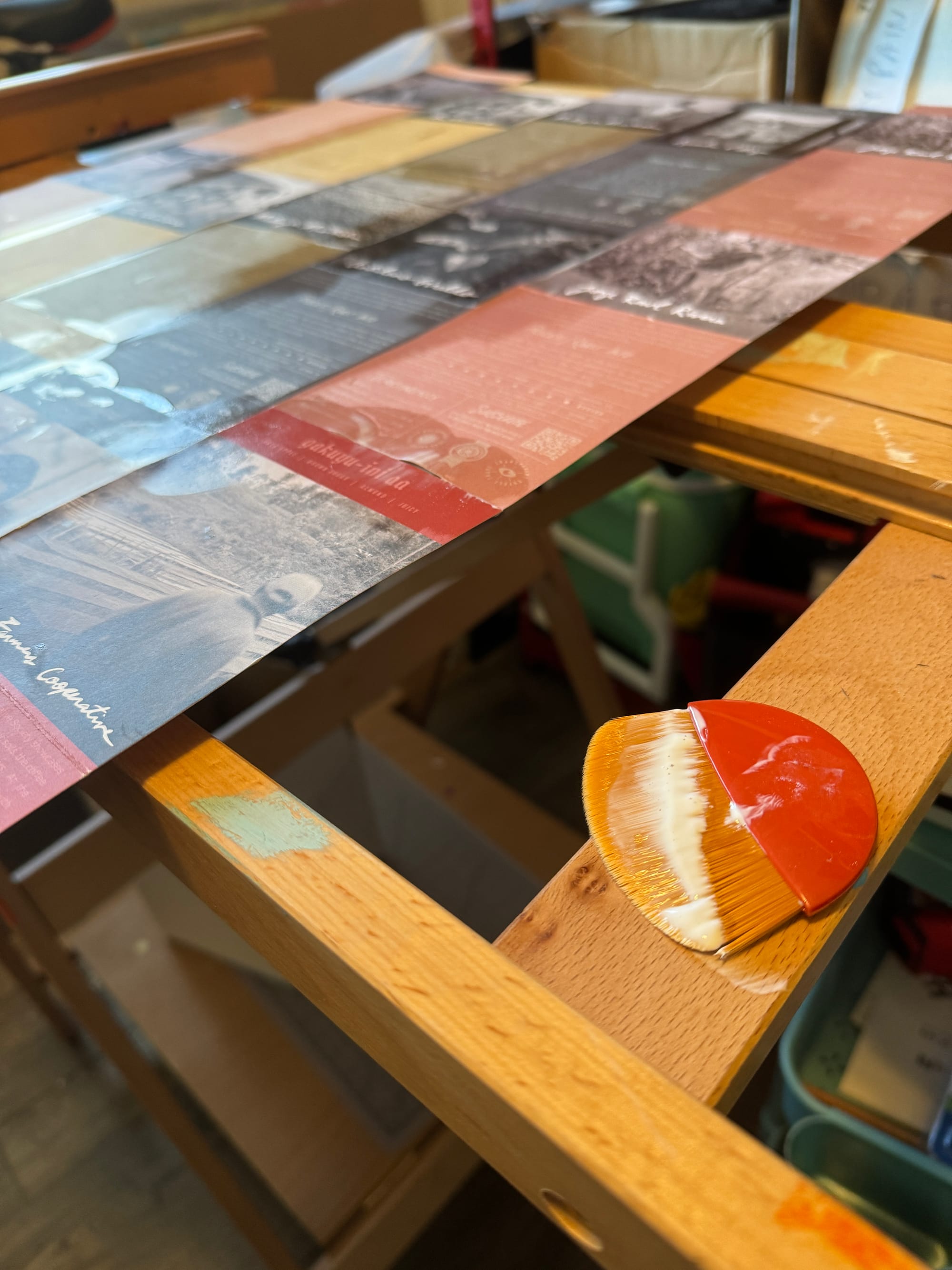
After letting the layers dry completely, I flipped it over and carefully trimmed off the remaining liner notes that exceeded the edge of the board.
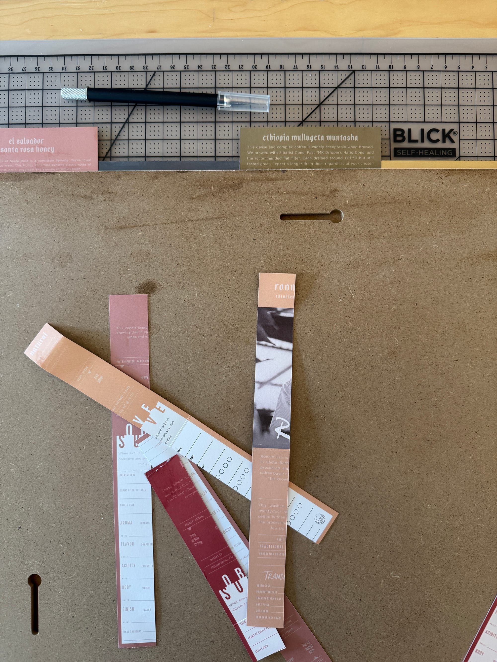
This looked pretty good, and I was ready to start fleshing out the foreground composition ...
I visualized an angled perspective, slightly top-down; I wanted the viewer to feel like they were "sitting at the table" with these artifacts. I hung up a cardboard "wall" to stand in as a backdrop, and I arranged these elements in the foreground:
- A skull (don't worry, it's plastic)
- A copy of Marcus Aurelius' Meditations
- A couple candlesticks (with old school "drippy wax" candles)
- And of course, my trusty coffee mug (thanks Griffins!)
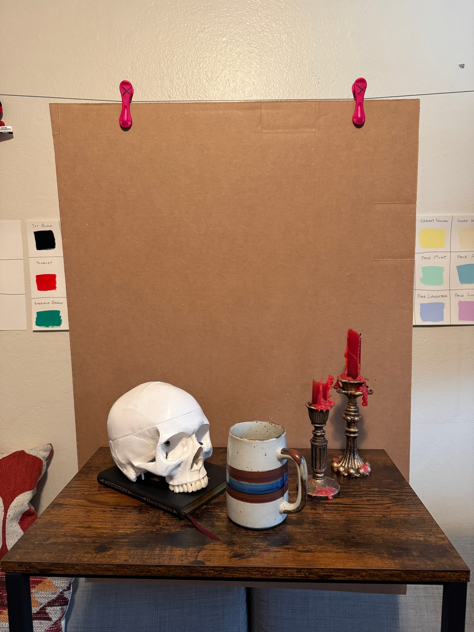
This arrangement felt right to me, having the coffee mug at the center of it all ... where the viewer could just reach out and grab it — and also there being a pointed "V" perspective gradually moving away from the viewer and providing some depth.
Next, I wanted to see what shadows looked like, when the candles were bouncing their flames off the backdrop ... Also (and this was key) I wanted to see that wonderful red wax drip drip drip!
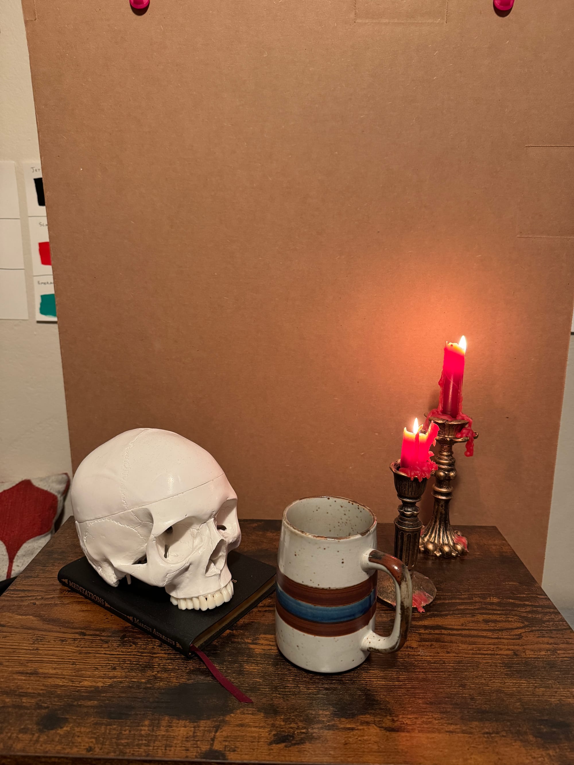
Although it probably would've been easier, I decided I didn't want to work from a photograph, I wanted to see the real thing and just ... stand with it. You know, be present with it, the entire time ... With that composition locked in (hey, don't bump the table, I'm working here!) I started laying down the layers of each element, stepping (more or less) backwards to forwards ...
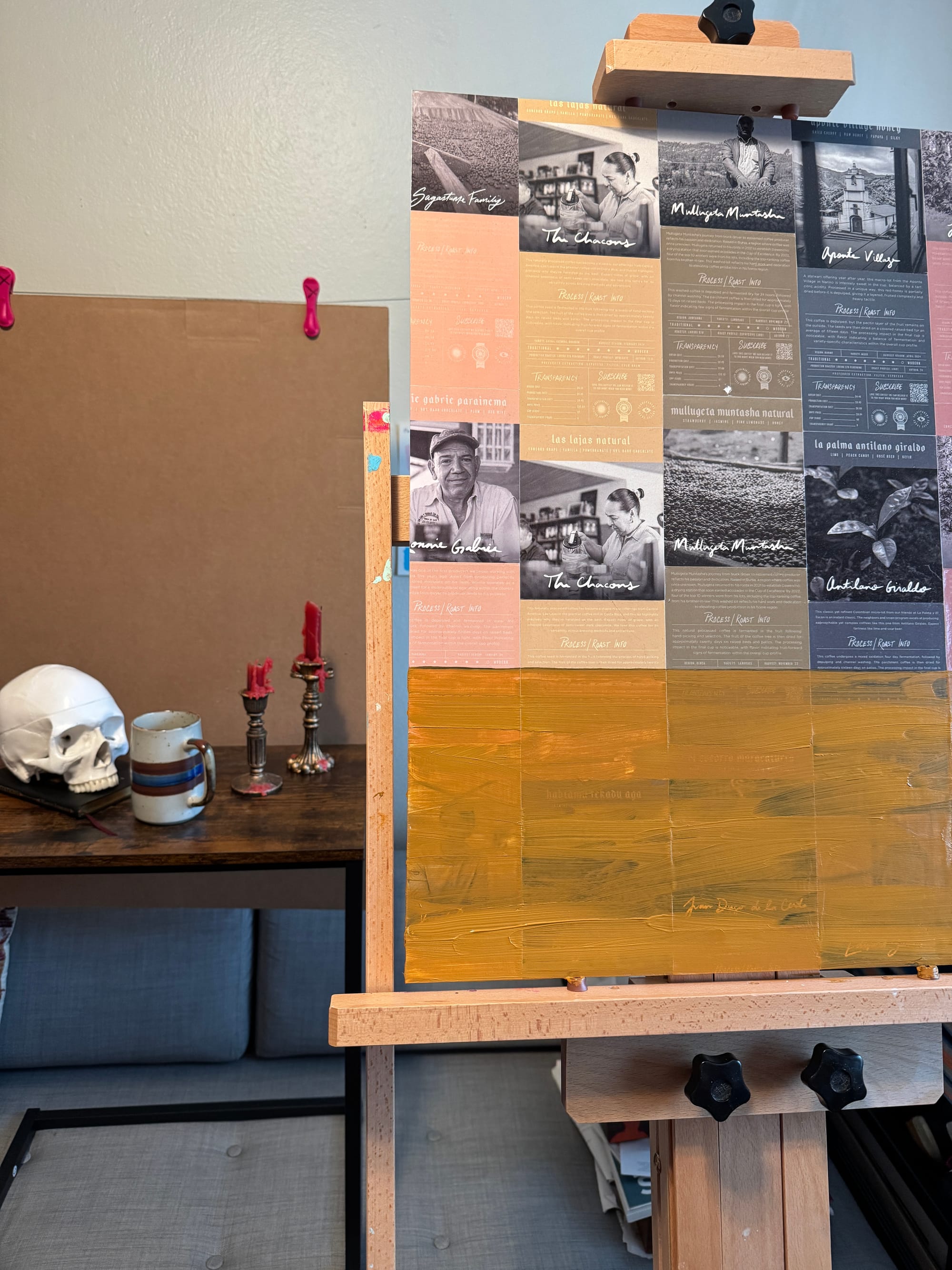
I loved the dark grains mixing over the umbers and siennas on the table top, so I wanted to convey that type of warmth. I intentionally kept these layers very loose, since I intended to "tighten up" on the elements atop the table itself. Also, the table just "felt like this" to me (more organic, rougher, etc).
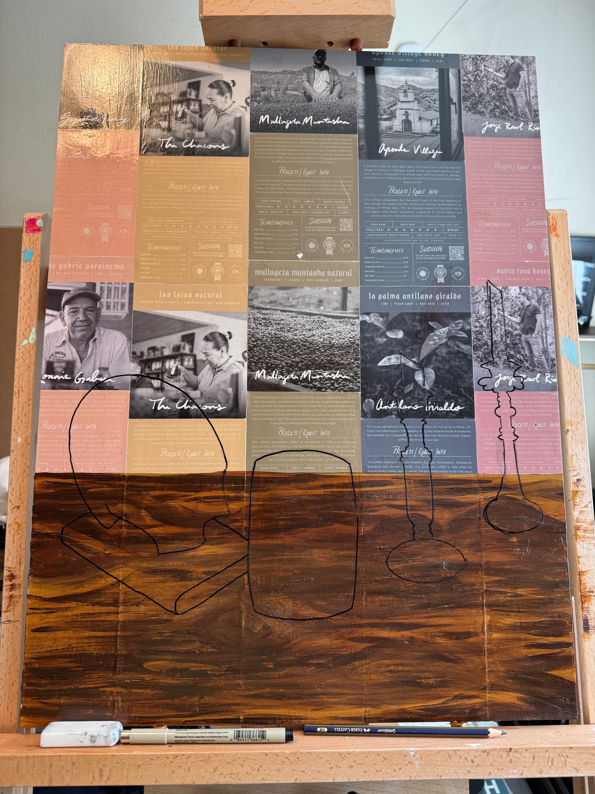
I freehand sketched in the basic shapes of the elements in the foreground. From there, it was essentially (again) building in reverse (for example: build the book, then estimate shadows on top of it, then build the skull that would cast said shadows on top of that, etc ...)
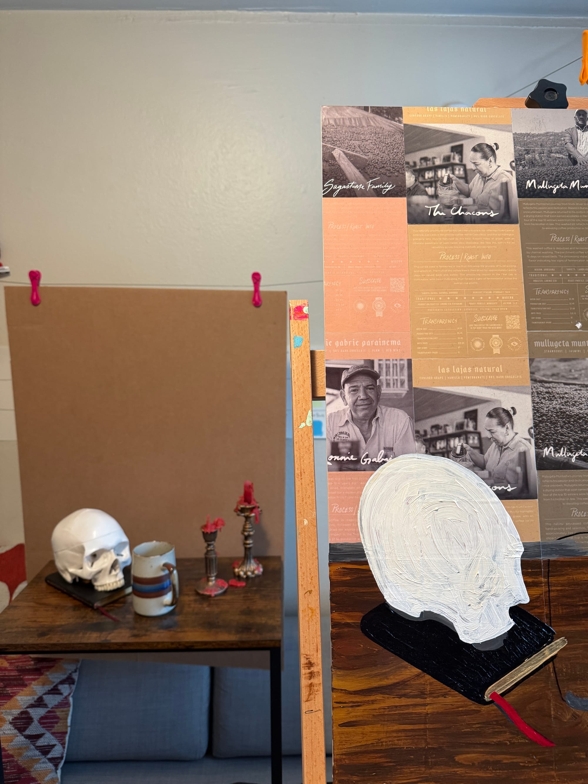
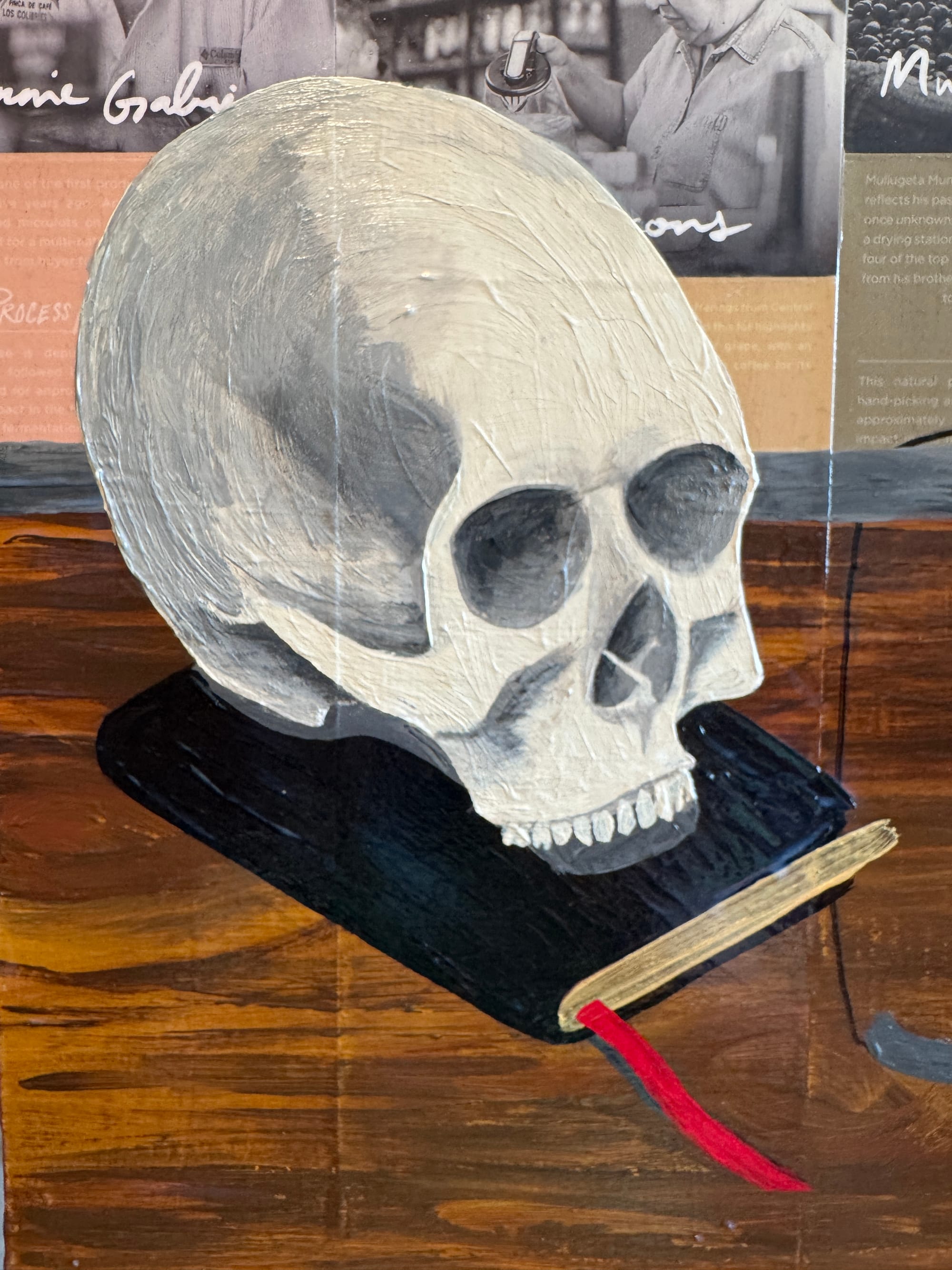
I have to say, working on the skull was probably my favorite part of the whole piece ... Not only was it just gothic and wonderful — I just had a great time building up layers and shadows and nooks and crannies ... And teeth! The teeth were so much fun ... I intentionally wanted to preserve some of the lighter / thinner transparency of the teeth, so I let that "shine through" (so to speak).
In some ways, the mug proved to be the most difficult element to capture ... Why? Well, in some ways, organic elements (like skulls) can be more forgiving, whereas a ceramic mug is ... a ceramic mug. That said, I wasn't going for perfection, I was going for what I saw. I was going for the essence of it.
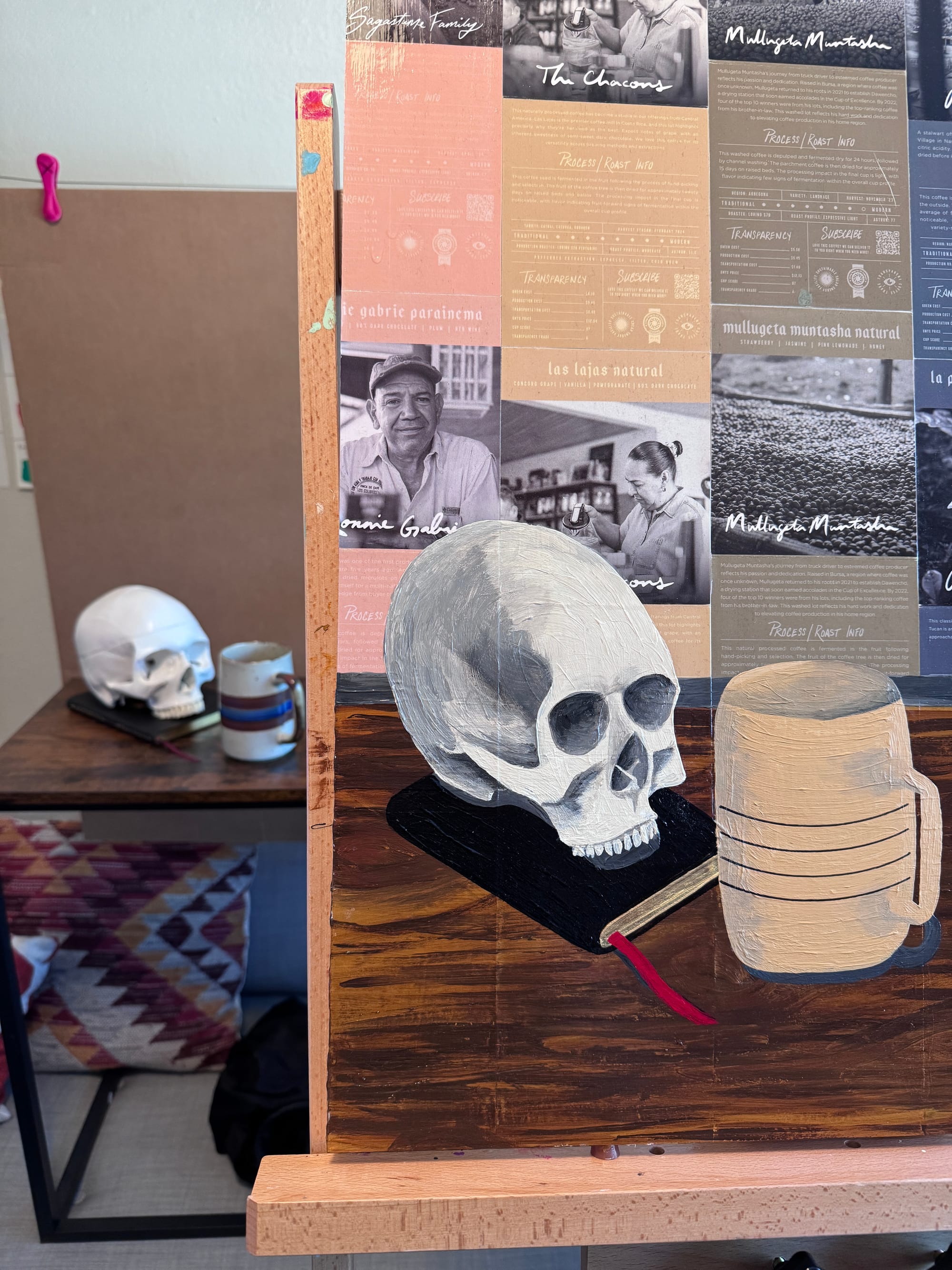
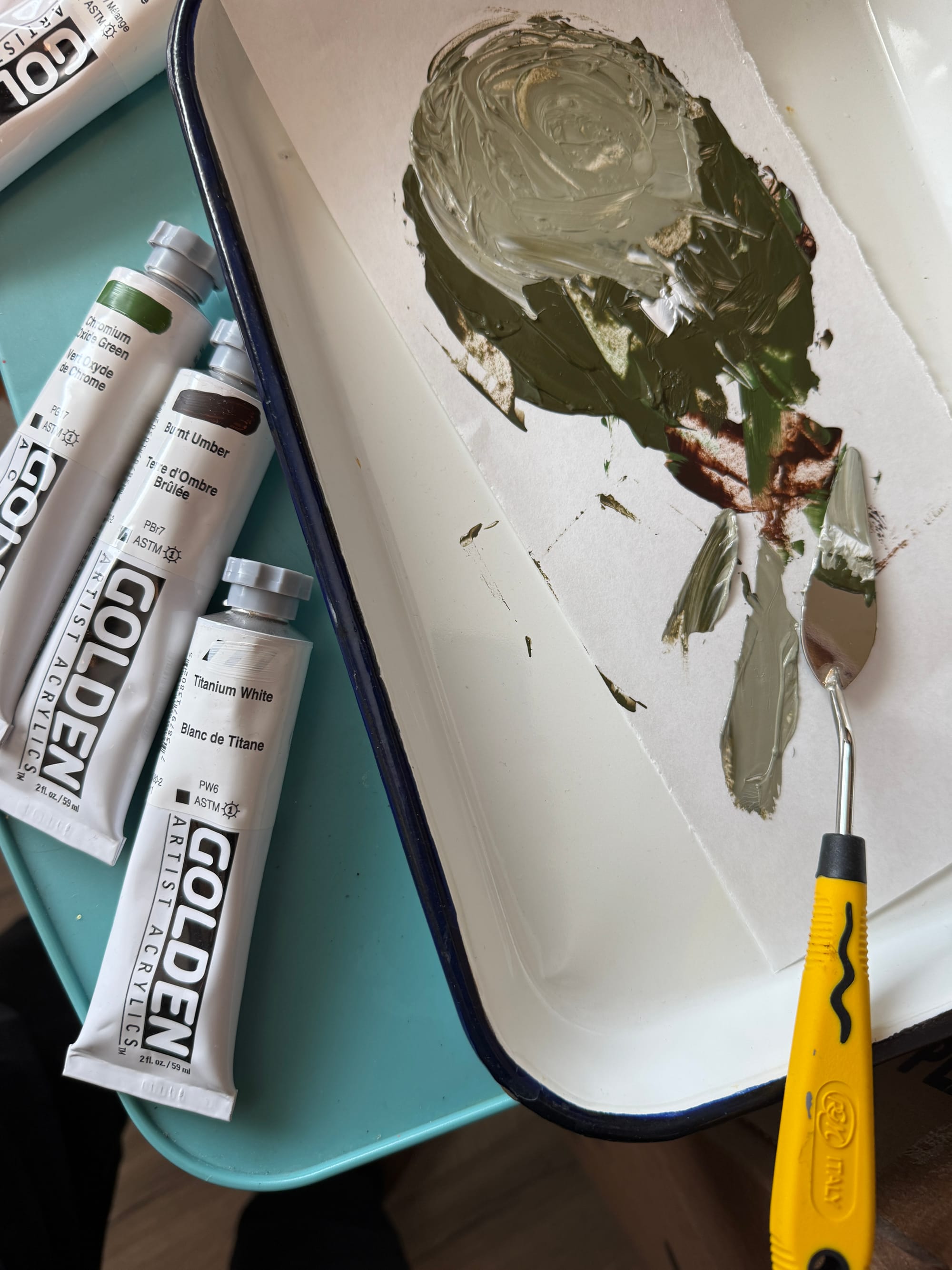
Using Heavy Body Acrylics can be difficult, but also quite a joy to move around ... Golden paints have such a high pigment load, they're incredibly versatile, and you can thin them out (if needed) quite a bit ...
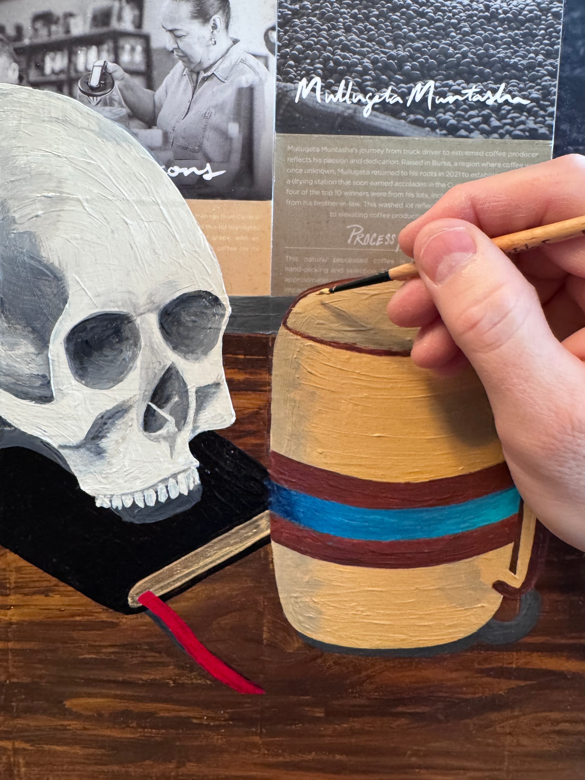
Using a tiny little detail brush, I got to go pretty micro ... I knew by choosing Heavy Body acrylics, there would be brush marks left behind, and that's exactly what I wanted. I wanted to preserve those marks, not hide them.
At this point, I started to feel pretty good about the direction of this ... I (more or less) worked left-to-right here. One curveball in this piece was working with metallic paint. I wanted to bring repetition to the piece, and using golden / brassy metallic paints to tie in not only the book pages but also the candlesticks together helped unify the overall composition.
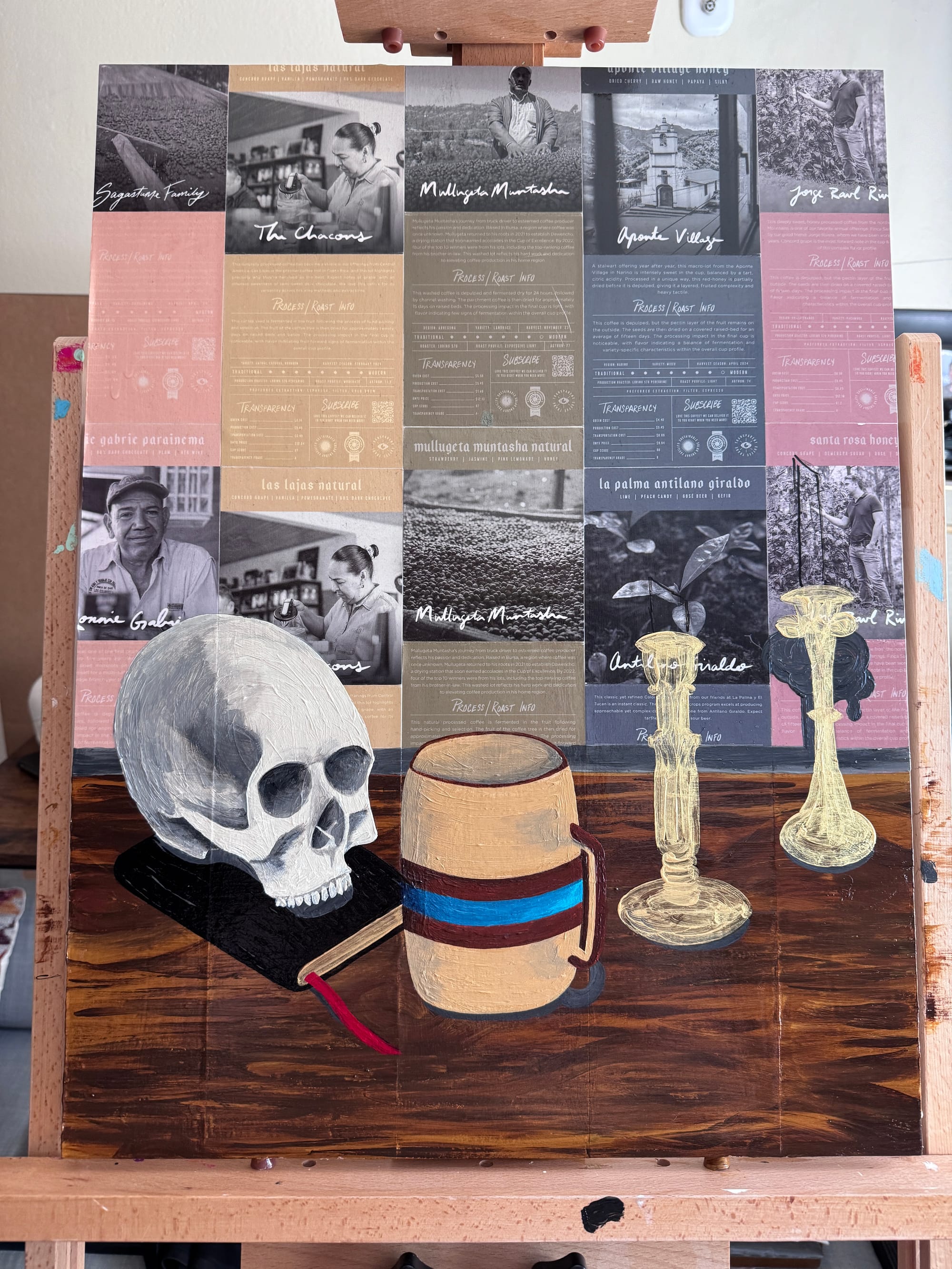
Working with metallics is satisfying, but it's also a little tricky because they are quite transparent, vs other colors that are much more opaque. They also have a different feel, so they lay down on the substrate a bit different, sometimes more stringy / ropey. This is not necessarily a bad thing, you just have to make a mental note of their temperament and adjust accordingly.
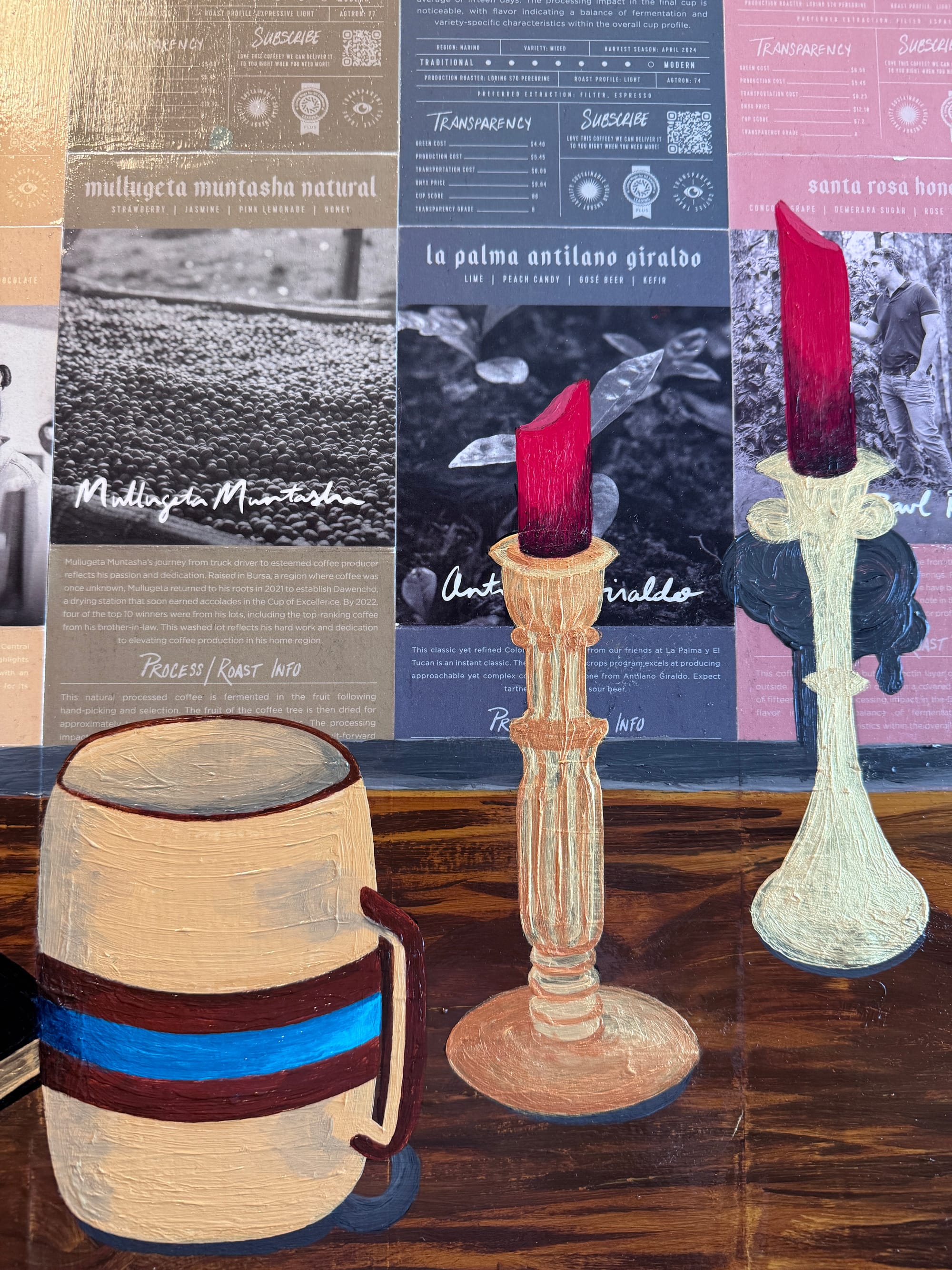
The candlesticks were quite a challenge; again, I wasn't going for rote literal translation, but more of telling the truth of what they were. I think I was able to capture that. Also, again, working a bit in reverse here: oftentimes you start with a darker background and build out on top of that; with metallics, since they're lighter and can be overpowered easily — I flipped the script and laid down the lighter tones first, and then built up darker detail on top. I wanted to preserve the lighter elements, and those can easily get lost or muddied if you put them on top of darker elements.
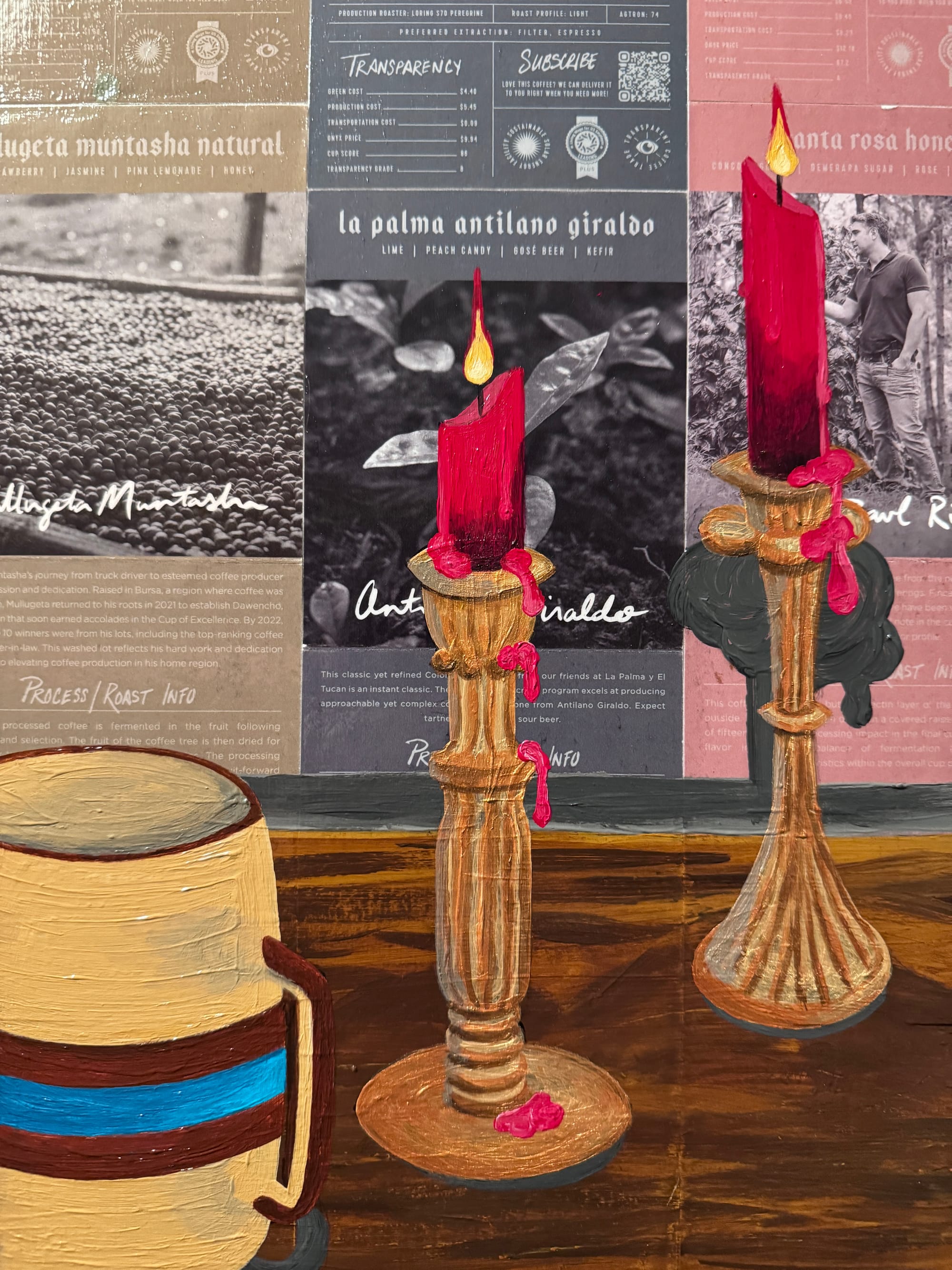
For me, one of the most fun parts of working on the candles was adding shadow depth to the interior of the wax candle ... the way that light hit it (or didn't hit it) was really intriguing to me, in a sense that the lower column of the candlestick was actually quite dark, and the section closest to the flame was (unsurprisingly) more voluminous. I wanted to capture that contrast, which helps give a bit of depth and shape to the candlestick. The part that made me excited (and a little nervous) was the "dripping wax" on top of it all. This was the "no turning back" moment ... I intentionally went heavier and "gloppier" (is that a word?) with this paint, as I wanted it to feel thicker and more viscous ...
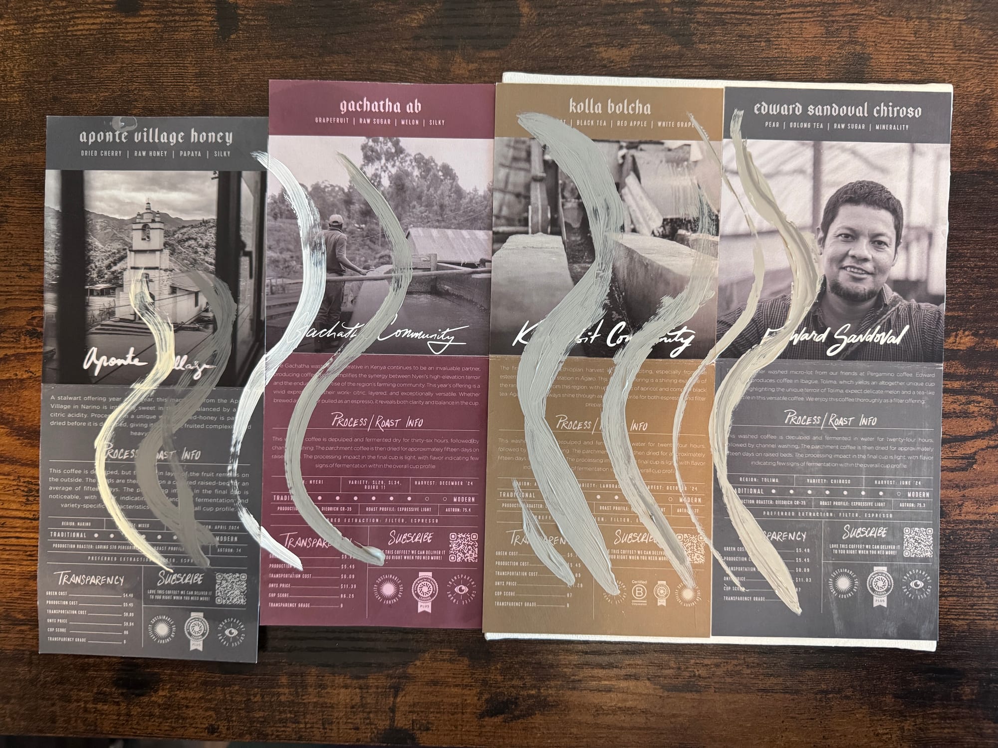
Last but not least, I wanted to add a subtle element of both steam and smoke to this piece ... I love "tendrils" in pieces, and I knew I wanted to see steam from the coffee right next to smoke from the candles ... Again, repetition ...
But I didn't want it to overtake the background that was already in place. So I chose to go more "wispy" with this. After putting the finishing touches on it & signing the piece — I took it over to the fine folks at POV.STUDIO to do a high-resolution scan of the final work.